As a field of growing understanding, digital accessibility can feel overwhelming in its complexity. From WCAG guidelines to all the specialist skills, it covers – content, design, coding and more. It can feel a lot so it often gets relegated to the bottom of the budget wishlists.
Yet 20% of the population reports having a permanent disability, with a further 20% having a progressive impairment. That’s up to 40% of your website audience in need of a highly accessible website, something no budget can afford to ignore.
Where to start?
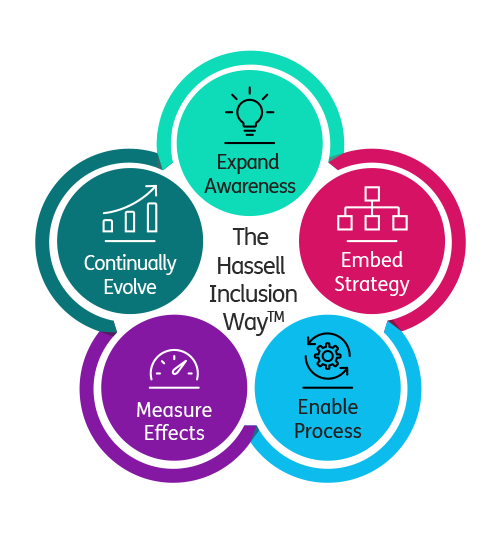
The Fat Beehive team has been trained by the experts at Hassell Inclusion and we aim to meet WCAG 2.1 AA standard for every site we design and build. Our accessibility statement applies not only to our own website but also to all the sites we create.
We also embed accessibility into our process, from design to build, as standard. For example, we check colour contrast and font sizing, embed ARIA labelling into our front-end framework, code landmarks for keyboard tabbing access and test all sites with Lighthouse.
But we also educate clients about the third core area of accessibility that’s often overlooked: content. We recommend training to their teams and human testing of their sites annually. The outcomes of any audit can then be implemented, knowing that accessibility isn’t a tick boxing exercise but an area to invest in year on year. Your site will need to keep pace as the WCAG guidelines improve, but you’ll also reach more users.
A range of needs
However, every site won’t be able to meet every user need. The breadth of human experience varies greatly: where a user with ADHD might want a calm and reassuring colour palette, that will be at odds with a visually-impaired user who would prefer a site with high contrast colours. Acknowledging that compromise is sometimes needed helps our clients be reassured.
It’s key, therefore, to be clear on who your audience is and what their needs are. It’s also fundamental that your accessibility statement acknowledges shortcomings and when you’re aiming to address them.
Test and test again
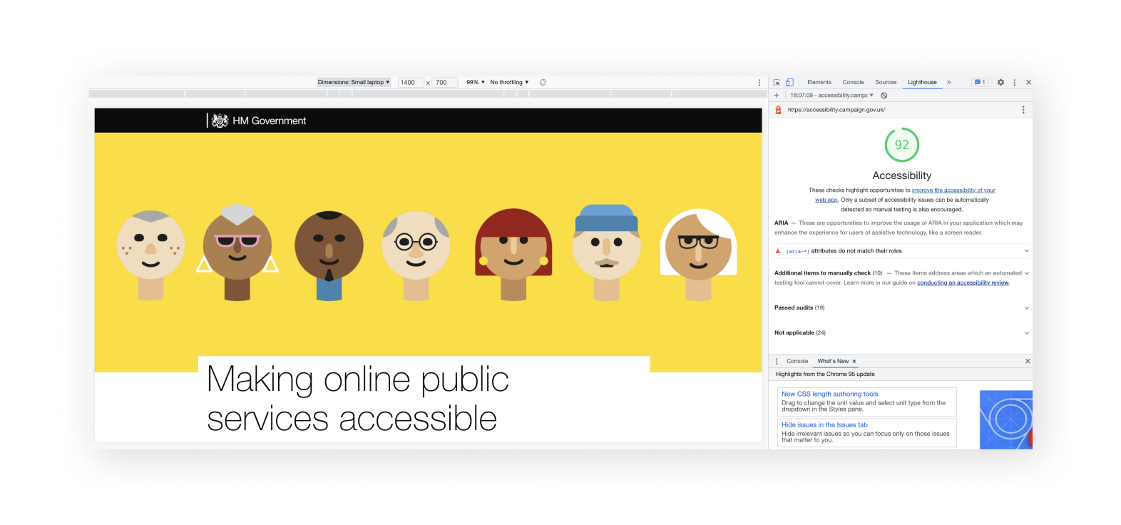
One challenge with accessibility is automated testing (which is cheaper) and human testing (which is more accurate). Even the government accessibility campaign site scores a high 92 in Lighthouse, yet I’d argue the light weight of the Helvetica typeface used wouldn’t be very legible for many users!