Many of us enjoy the chance to get creative in PowerPoint presentations or Google Docs. The font menu is often the first thing my daughters start playing with on homework documents, sometimes even before they’ve written the content!
But with so many available options, what does your font say about your organisation? And with so many now free through services like Google Fonts, why does it matter which typeface you choose for your website or brand?
Visual and verbal tone
Fonts are one of the most effective – and subtle – tools to communicate your charity’s personality within a visual identity. Too often fonts are undervalued, thought of as unimportant, if thought of at all.
But along with colour, photography and illustration, they tell your audiences who you are, and how you speak. They are the visual expression of your verbal brand and when ignored, could present your organisation as unprofessional or worse, uncaring.
But what about free fonts?
Not all fonts are created equal. Typography, like any creative pursuit, is a specialist skill, taking years of training and practice to create fonts with unique detailing, personality and provenance. The best foundry’s in the business hire those specialists and a single font can take years in development, ensuring each character, in each weight, in each language is perfect.
So while your organisation won’t likely be able to invest in type the way Airbnb or the six weights and six languages of Renault have, nor should you default to free fonts. After all, you get what you pay for.
Google fonts have been improving in their number and quality recently and if your organisation uses Adobe, their free Adobe Fonts package does have a higher quality of designs. But when speaking to your audience, surely you want to do it in a way that is unique to you? So if they can’t see your logo as they scroll down your website, they still know it’s you?
Characters with personality
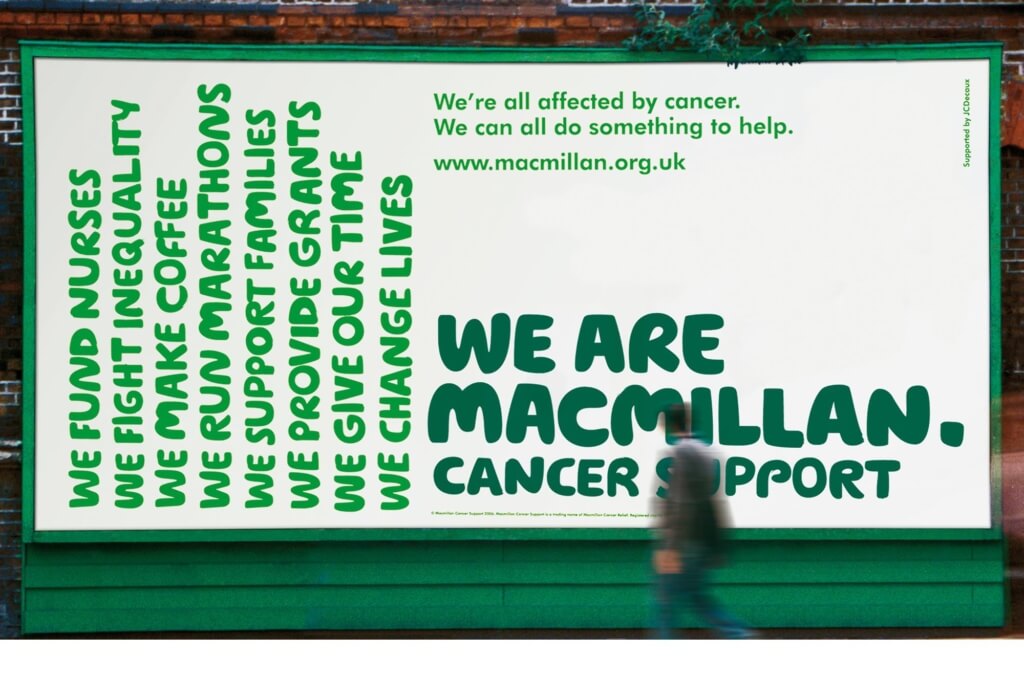
When we think of MacMillan we think of care and support, which is perfectly reflected in the hand-drawn, rounded and friendly letters of not only their headline typeface but their very logo itself.
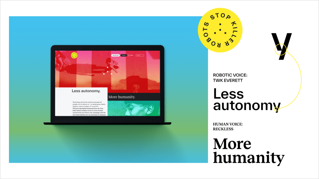
Our rebrand for Stop Killer Robots targets Millenials and Gen Z, so the typefaces chosen are modern and on-trend. They also have two brand fonts – one to use when they speak in their ‘human’ voice and one for their ‘robot’ voice. The human font is more rounded, friendly – whereas the robot font is sharper, with cut-in details almost like the glitches used on the website.
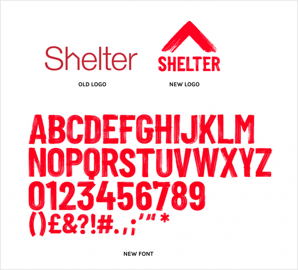
Shelter’s powerful rebrand uses a bespoke painted typeface which reflects their shift towards an activist positioning, something happening across the third sector. While on the other side of the housing market sits Zoopla, with digital-first fonts and ‘journey lines’ joining characters to show the ups and downs of homebuying.
It’s about trust
Consistently using a well-crafted and purposefully-chosen font can build trust with your audience, reassuring them they’re being spoken to in whatever your tone might be: be that caring, campaigning or informing. And given how much effort goes into creating just the right words to connect with your users, across all your channels, isn’t it worth ensuring they receive that message in just the right visual tone also?