Delightful Ethical Digital
The Trampery header image

The Trampery

Rebrand and web design for London’s social purpose workspace operator

Read the case study

The challenge

Through low-cost local workspaces and access to training, The Trampery supports entrepreneurs and start-ups from under-represented backgrounds. Helping to develop the next generation of difference-makers, the Trampery is focused on providing spaces for positive change and for impactful businesses to blossom.

As a brand, The Trampery was lacking visual consistency across all its channels. As a social enterprise, it also needed to differentiate itself from peers and competitors in the workspace community, especially as its offering expands into local government, innovation services and even company retreats.

Trampery logo development
Trampery typography
New logo for The Trampery
The new brand evolution

The brief

The Trampery needed an invigorating rebrand that would connect with younger, diverse, and more socially-engaged audiences, whilst retaining their sincere, informal tone of visual voice. As innovative leaders in their space, the organisation wanted a brand that represented their ideals of boundary-pushing and a brighter and more diverse future.

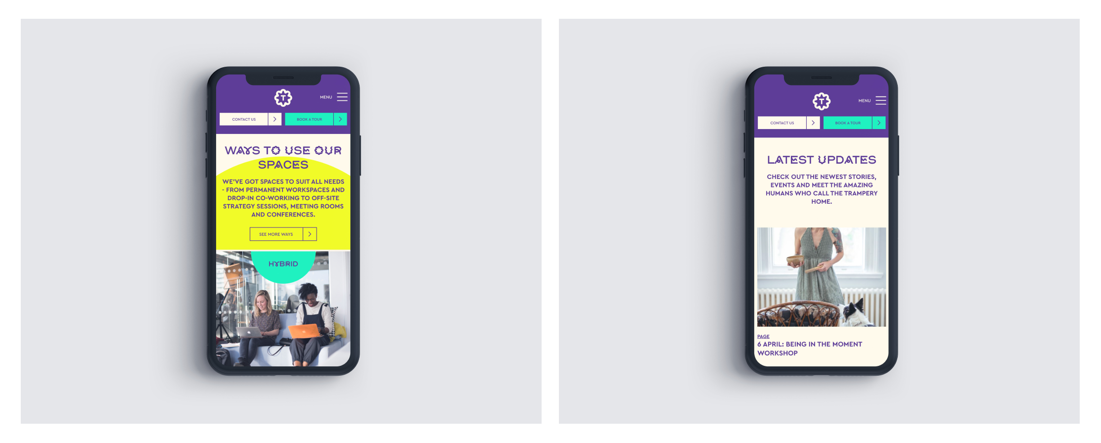
Alongside this, a new website was required that was easy to navigate and would generate workspace, learning programme and venue hire enquiries – whilst maintaining focus on The Trampery’s social impact mission and values.

The process

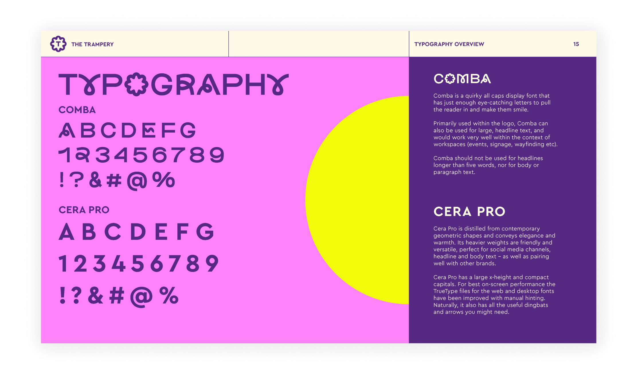
From a brand perspective, the logo has been recreated from scratch. Developing a number of executions through creative ideas in the form of mood boards, the ‘visionaries’ route best captured the values and mission of the organisation. Combining a unique and contemporary font with people-centred imagery and a bright contrasting palette creates a distinctly fresh and modern brand.

A comprehensive discovery report and a brand audit revealed that many users weren’t exploring the site further than its homepage. By focusing on The Trampery’s members, an intuitive sitemap has been developed and homepage content created that suits website users and the goals of the organisation, whilst building an online community for those with shared interests.

Trampery mobile images
New templates allow the brand to flourish

The solution

The result is a strong, playful wordmark that is uniquely identifiable, while still flexible enough to adapt to many variable applications and sub-brands. The distinctive font and refreshing colour palette lead the rebrand, with community kept at the heart and centre of The Trampery through improved photography guidance. 

A brand new clear grid system and modular site layout also help users navigate quickly, be they budding entrepreneurs looking for their next creative space or growing organisations seeking to advance their purpose through an Evo Impact course.

Visit the site

Get in touch

Speak to us about your project, get a quote