Delightful Ethical Digital
Hands massaging a persons back

World Physiotherapy

An expressive visual identity for the global body for physiotherapists

See the brand

The challenge

Founded in 1951 the World Confederation of Physical Therapy (WCPT) has been the global organisation for national physiotherapy associations, helping develop, maintain and restore people’s movement and functional ability. Today they represent more than 625,000 physiotherapists worldwide through 121 member organisations (MOs).

However, in their words, they had a “dated, traditional, staid image which contrasted sharply with the reality of the profession and its individual members”. WCPT challenged Fat Beehive to develop a modern, dynamic and vibrant brand which reflected the organisation and its members. 

Sketches for the World Physiotherapy website layout
The construction of the World Physiotherapy icon
The World Physiotherapy logo
The finalised icon incorporated shapes for 'connection', 'movement', 'wellbeing' and 'global'.

The brief

WCPT felt they were being viewed as a ‘Debenhams’ within their brand space (safe, dependable, reliable), but were hoping to be more ‘Liberty’ (a heritage brand that has successfully reinvented itself). Our guiding quote from an early meeting was “the escalators will be empty at Congress”, which revealed the essence of the organisation: active people who would much rather take the stairs!

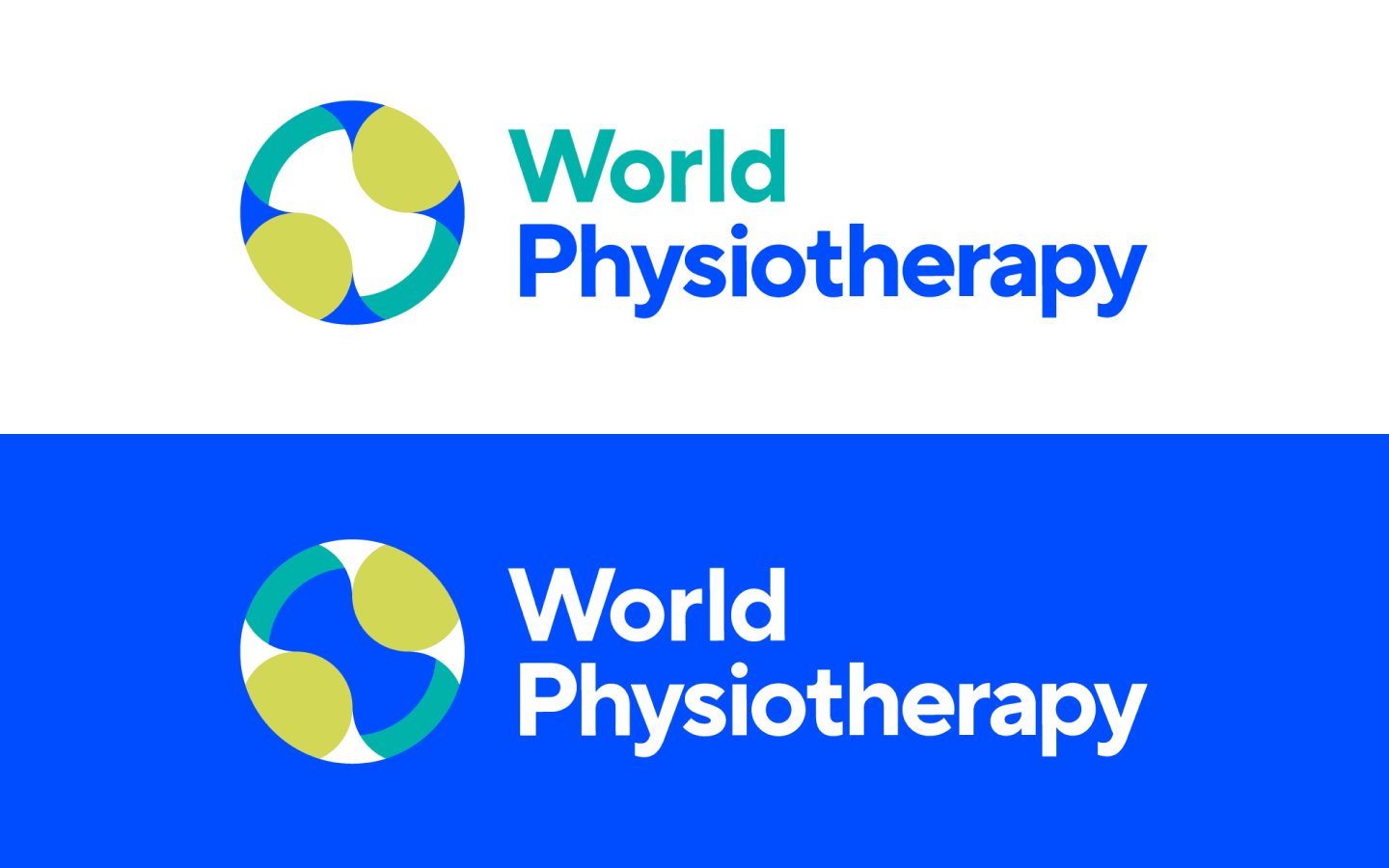
WCPT had also approved a new snappier name for us to build from – World Physiotherapy – which freed us from acronym territory (and we know how much the third sector loves an acronym!).

The process

Our brand audit revealed a rich and empowered history, often driven by women, with this video from the first International Congress showing just how progressive WCPT was, and still is. It also revealed national physiotherapy associations had moved ahead of the global body in their presentation, making WCPT look outdated. 

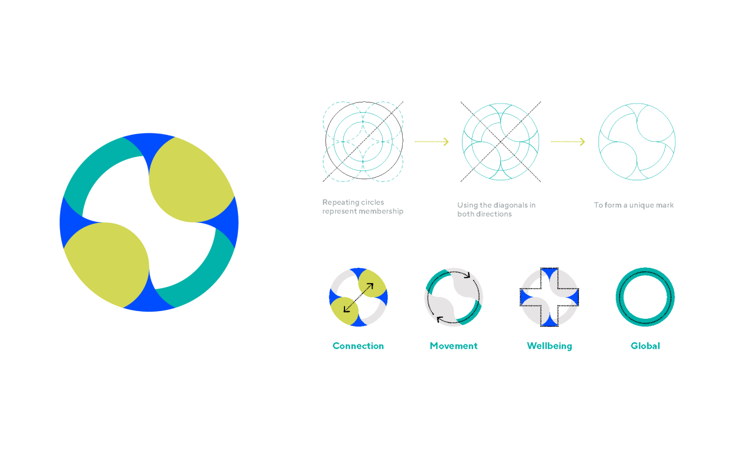
Through mood boards, we began exploring visual and typographic concepts for movement, colour and professionalism. We kept blue as the lead colour for continuity but dialled it up to a rich, vibrant tone, which works especially well on screens. 

We investigated icons, new logos, typography and patterns, as well as modern interpretations of globes, subtly referencing the organisation’s early logos.

The World Physiotherapy sub-brand logos

World Physiotherapy also needed logos for each of their sub-brands: congress; World PT Day campaign; regions; member organisations, subgroups and networks – 320 were produced in all

The solution

Throughout, circles became key. Our solution uses circles on a grid to represent movement, the globe, wellbeing and connection. 

The icon is unique and memorable while being simple and timeless. The unusual shape of the yellow sections has been broken out and used as a device across marketing materials, with blocks of colour complementing the photography of the work and activities of World Physiotherapy. 

The fresh colour palette complements the lead blue with tennis-ball yellow and verdant green, while the modern typography of TT Norms is available across many of the world’s languages – fundamental for any global organisation.

How the World Physiotherapy brand is applied to a tote bag
World Physiotherapy business cards
The design of a World Physiotherapy report cover
The World Physiotherapy brand brought to life across assets

The results

Applied across all channels from the website and social media to printed reports, T-shirts and stationery, the brand was launched on 30 June 2020 to a wonderful reception from member organisations and physiotherapists around the world. 

Now fit for the launch of the new site in 2020, Congress in 2023 and beyond, we’re looking forward to supporting World Physiotherapy on their brand journey.

Visit the site

Results

World Physiotherapy icon
“We asked Fat Beehive to come up with a brand that was more inclusive and better reflected the global physiotherapy profession. Feedback about the brand has been really positive – people love the vibrancy and freshness.”
Freya Rodger, Head of Marketing and Communications, World Physiotherapy

Get in touch

Speak to us about your project, get a quote