Delightful Ethical Digital
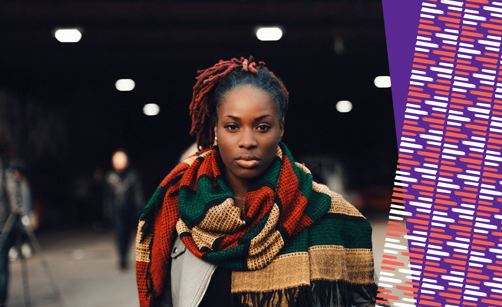
A powerful black women wearing a scarf staring at the camera

FORWARD

Striking new brand & website for the anti-FGM charity

How we helped

The challenge

For over 30 years, FORWARD has been the leading African women-led organisation working on female genital mutilation (FGM), child marriage and other forms of violence against women and girls. However, their subdued visual identity and old website’s low-impact design simply wasn’t capturing the organisation’s dynamism. It was time for a full refresh.
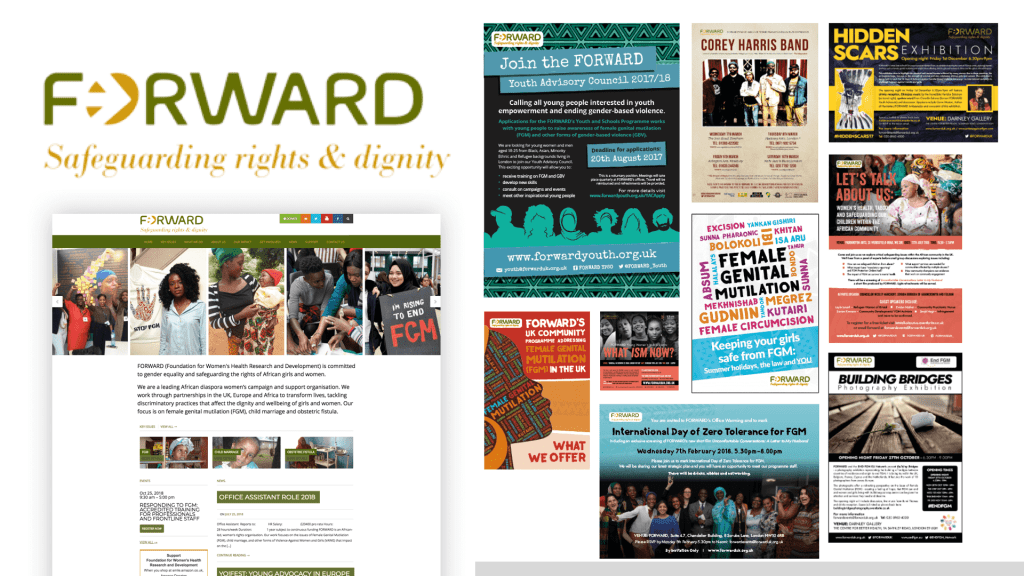
A selection of old assets from FORWARD

The brief

FORWARD is unique in working holistically to tackle FGM, incorporating cultural, community and family solutions, rather than treating it purely as a medical issue. With the primary audiences being those affected by FGM in the UK and Africa, as well as potential donors and funders, FORWARD wanted a bright, bold and memorable brand. 

The new visual identity also needed to be optimistic and warm. While the issues they work with can be seen as dark and taboo, FORWARD is a fundamentally solutions-orientated, hopeful organisation that sees women and girls as survivors, not victims. The organisation’s programme teams work across the UK, Europe and Africa, so our design work needed to be accessible and culturally inclusive.

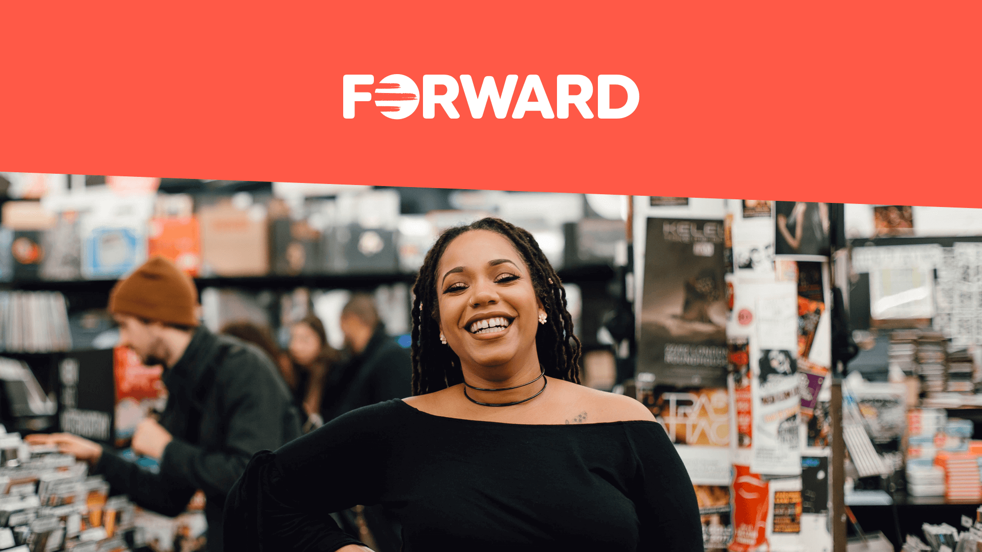
Woman smiling at the camera alongside new FORWARD logo
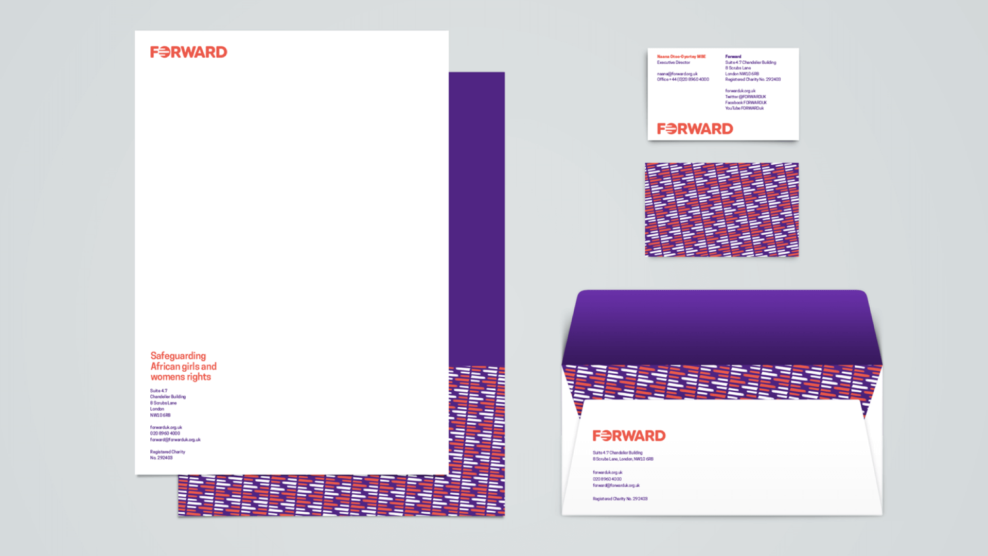
FORWARD stationary samples featuring the redesigned brand
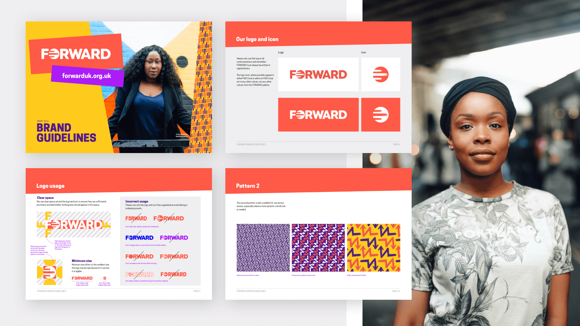
FORWARD new brand guidelines showcasing logos and patterns
The FORWARD logo and brand guidelines

The process

Following an audit of existing marketing material and the competitive design landscape, we took inspiration from Afrofuturism, vibrant patterns and textured illustration styles. 

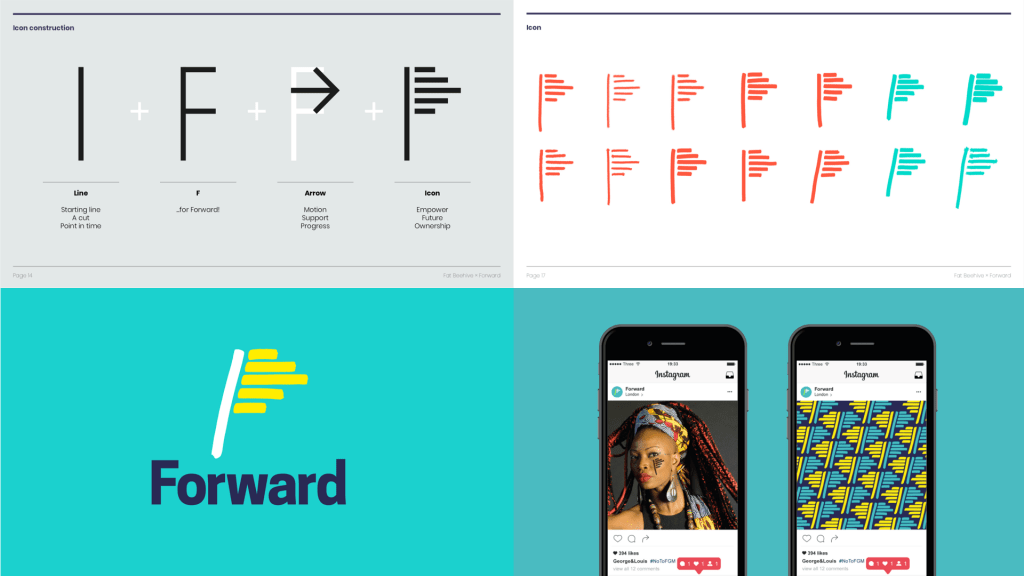
However, when we presented our first proposed new icon and typeface to  FORWARD, the team felt they needed more continuity with their previous visual identity. While it was a firm yes to the vibrancy, patterns and idea of multiple lines representing collective motion, we moved to the next design step as ‘evolution, not revolution’. 

FORWARD initial logo rebrand proposal

The solution

We kept the three brush strokes in the icon and the patterns that represent the collective nature of support and campaigning FORWARD offers. They believe we can only achieve their aims of dignity, choice and lives free from violence for African girls and women through the three interlinking pillars of partnerships, family and community collaboration.

The bold colour palette is warm, friendly and progressive and combined with the contemporary sans serif of Cooper Hewitt as the primary typeface. The patterns repeat strokes from the icon, as well as an abstract ‘F’, in different colourways according to the mood of the marketing material: light and bright for positive messages; dark and sombre for more serious material.

FORWARD flyer showcasing new brand
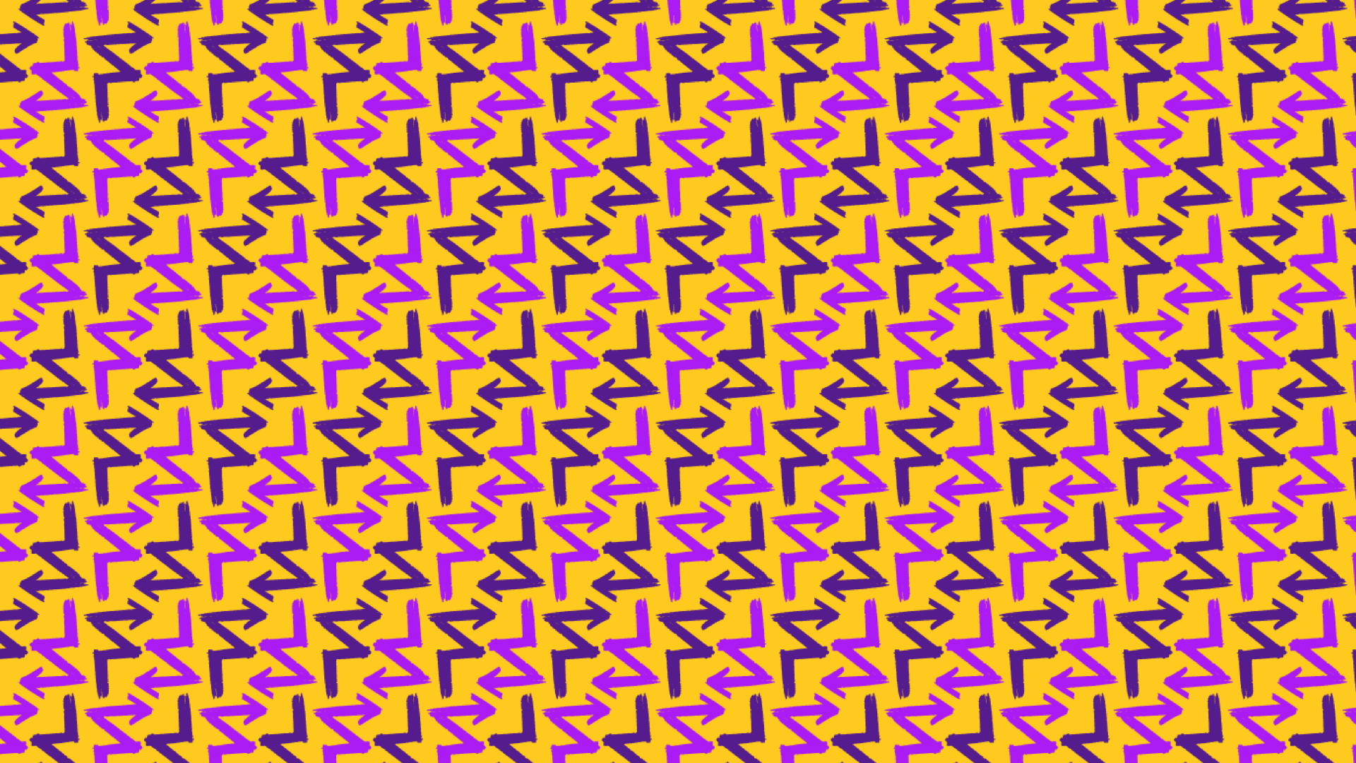
FORWARD vibrant yellow and purple pattern sample
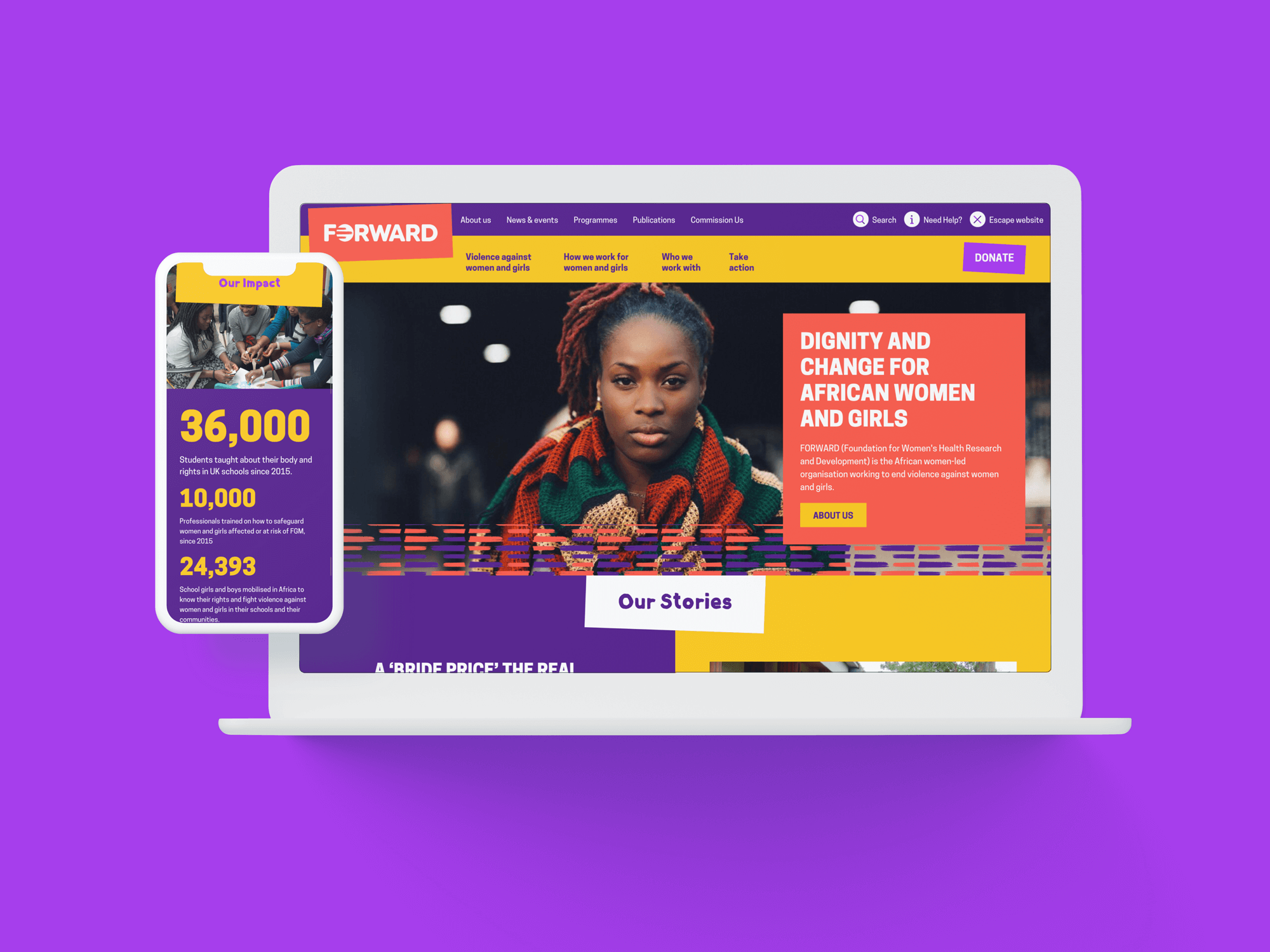
The FORWARD website on multiple devices
FORWARD’s new brand and patterns can be applied across multiple asset types

We selected a powerful set of photographs by Marianne Olaleye from FORWARD’s archives, putting them front and centre on the website and branded materials. As soon as you reach FORWARD’s key landing pages, you have no doubt what they stand for and how they go about tackling violence.

The website

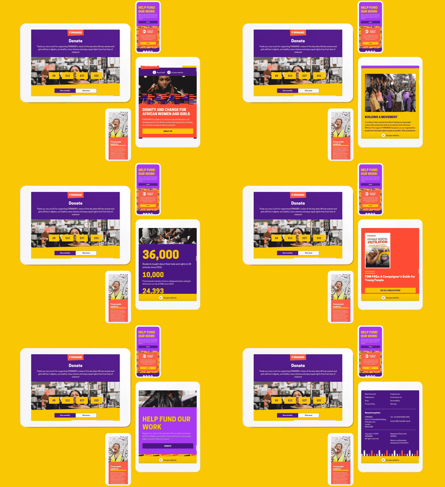
The brand coalesced across all the components on the website: from the powerful homepage to detailed pages on FORWARD’s various publications. To engage and delight their users, we added subtle design touches like the donate button that wiggles when you hover over it and a static, textured background behind the newsletter sign-up. The big block colours give the site a bold personality, while the ‘Escape this website’ button acknowledges the challenges some of their users face. 

Forward website design showcased on a laptop and phone device

FORWARD needed newsletter and payment gateway integration but had limited comms resources to manage the data purely on the CMS and a budget that couldn’t stretch to full CRM integration. So we worked together with CiviCRM to implement a WordPress plugin that achieves what they need without having to carry out a full integration.

We designed a series of bespoke Page Builder components that reflect FORWARD’s new branding and let the team create a huge number of unique templates for different types of content across the whole site. They’re now well-placed to capitalise on the recent higher profile of FGM and help more women and girls overcome violence and abuse.

Visit the site

Results

FORWARD UK icon
“Fat Beehive had a task on their hands to encapsulate the essence and personality of FORWARD in a way that was non cliché and brought our look up to level the organisation has grown to. We love the way they worked with us, took all our feedback on board and managed to make everyone happy! We wanted to stand out, show our boldness and be unashamedly African in our look and this is what Fat Beehive have achieved for us. The team were a joy to work with and went above and beyond to give us what we needed.”
Naomi Reid, Communications and Events Manager, FORWARD

Get in touch

Speak to us about your project, get a quote