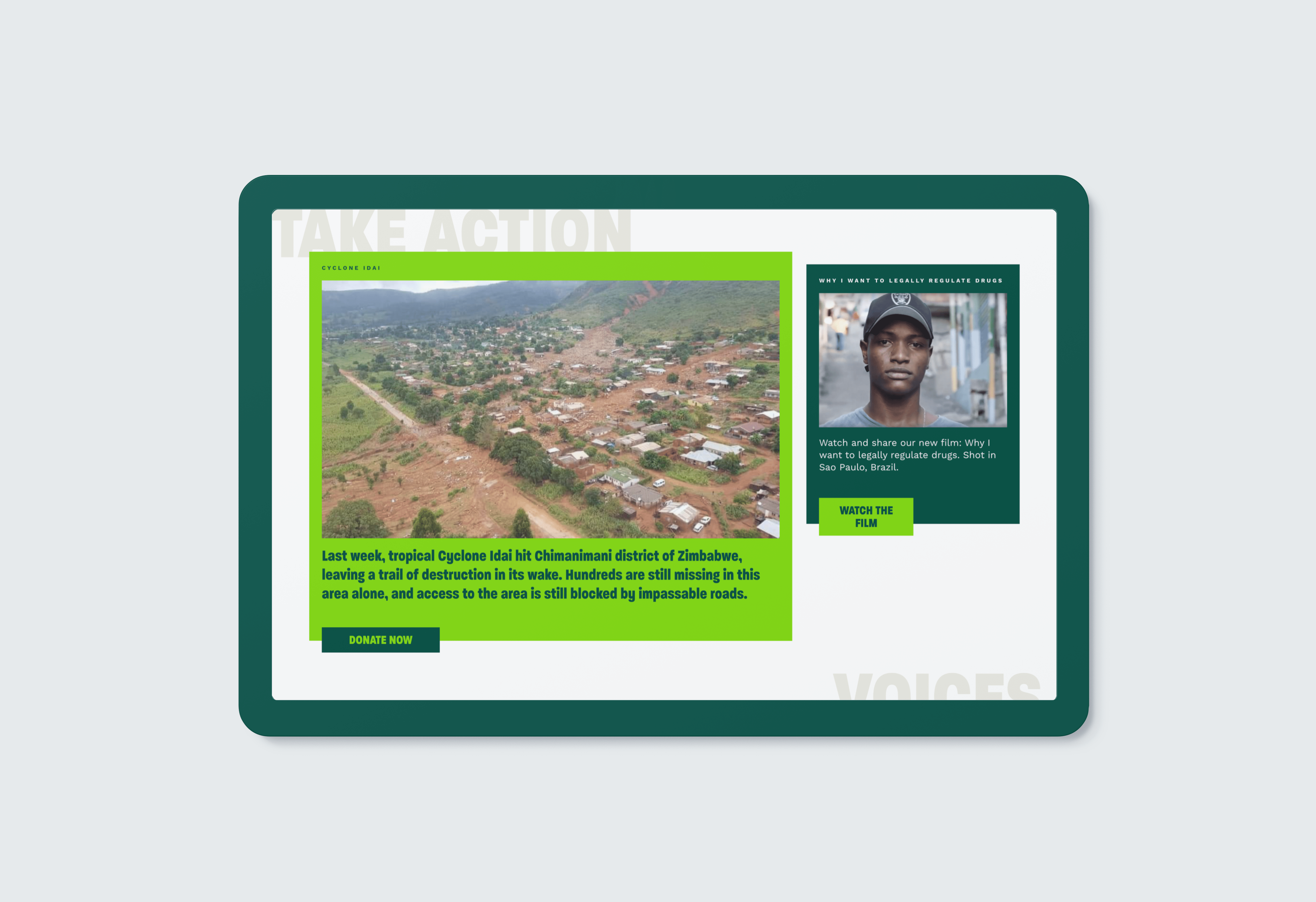
Delightful Ethical Digital
An HPA health worker with rubber gloves on helping another woman

Health Poverty Action

Vibrant, action-focused Wordpress website

How we helped

The challenge

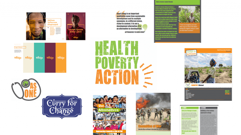
Health Poverty Action came to us with a site that was 10 years old and severely restricting their creativity in growing their fundraising and communications efforts. The design was dated, with a dull colour palette and confusing layout. To complicate matters they had several visual voices, with different looks across digital and print, including sub-campaign brands that were separate to the main brand.

The brief

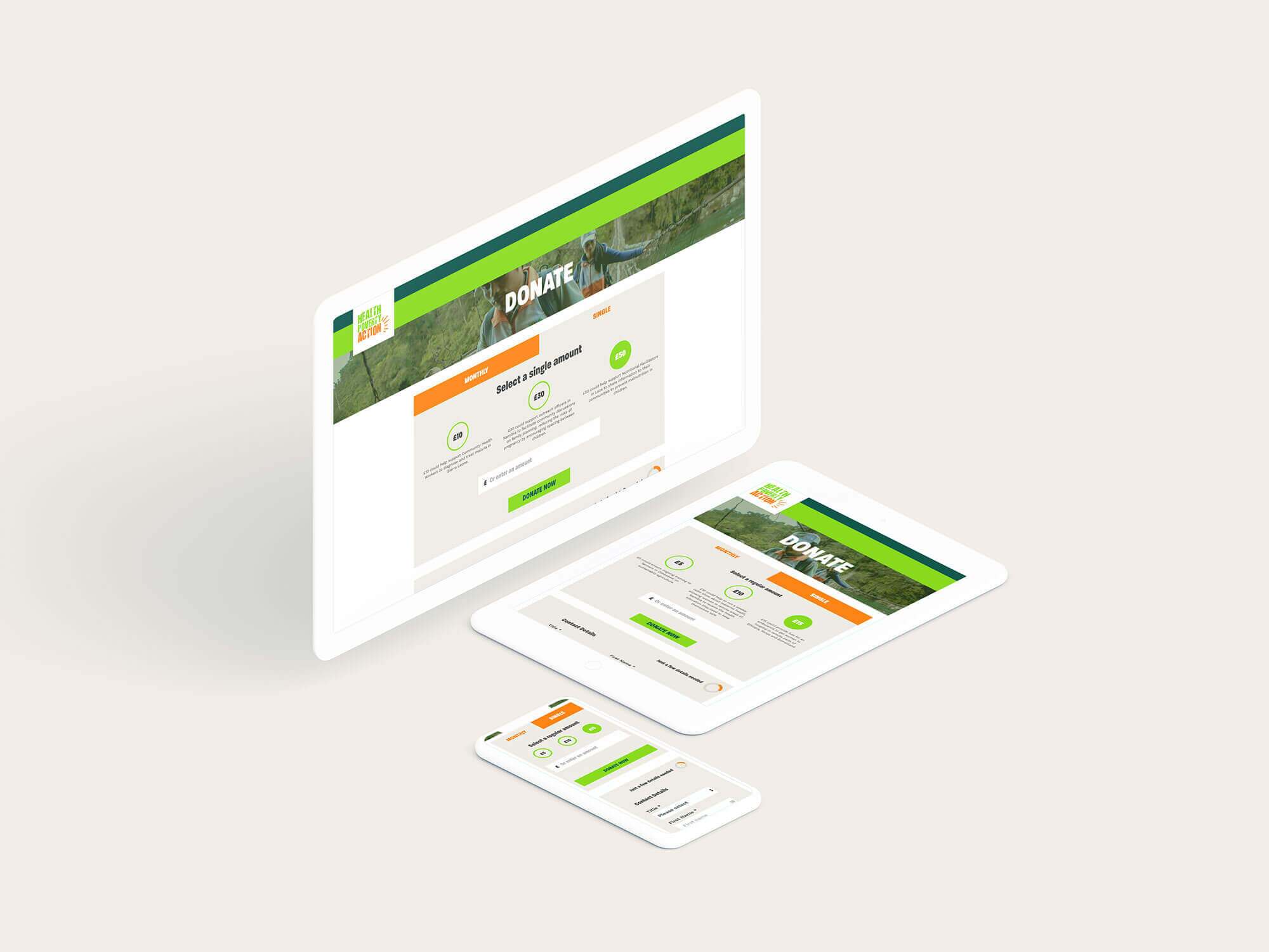
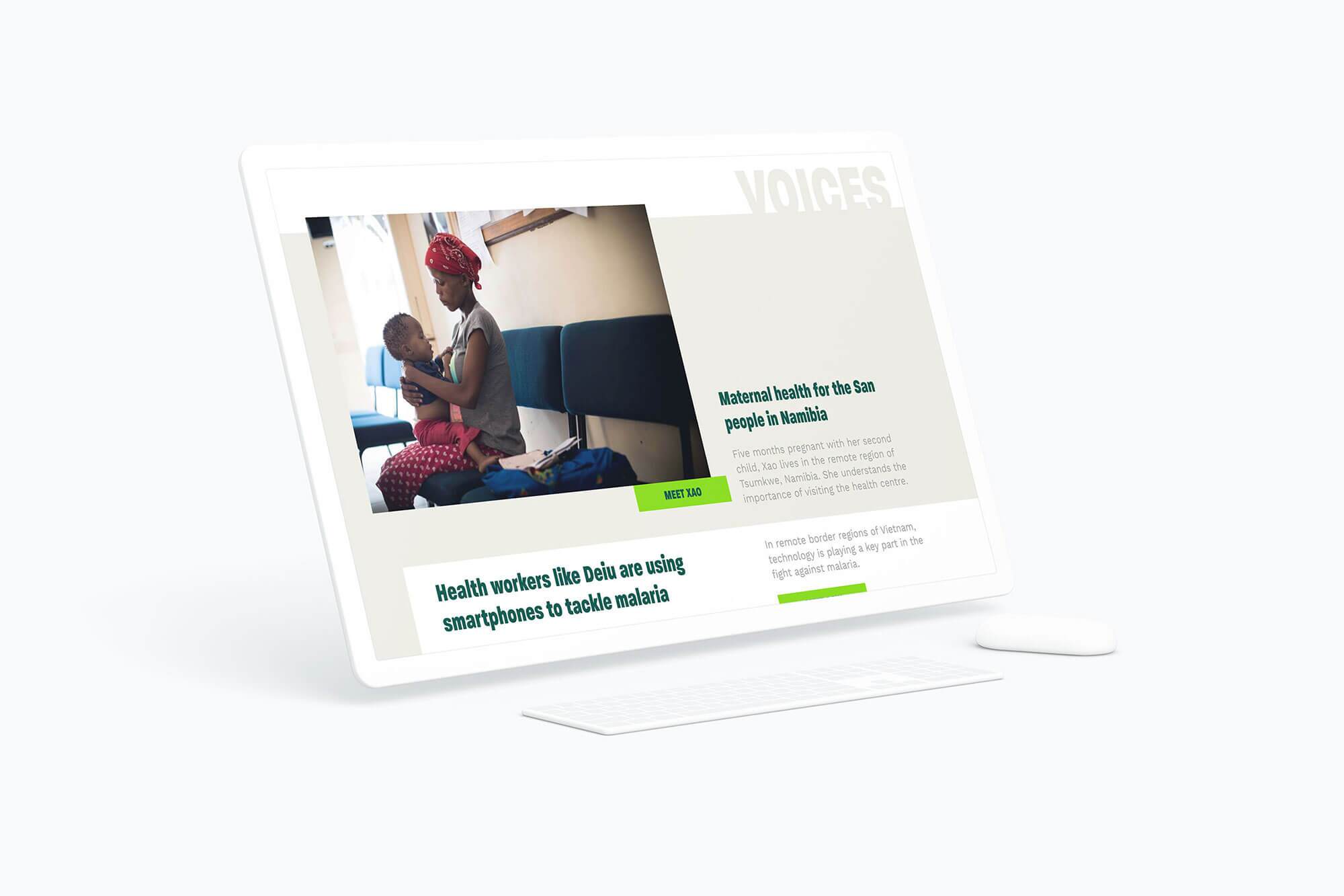
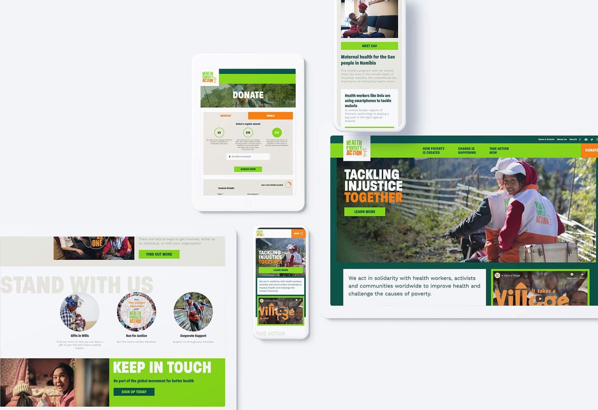
Health Poverty Action wanted their new website to act as a tool for fundraising, campaigns and storytelling. Its design needed to convey the organisation’s grassroots focus and non-corporate personality, putting local communities front and centre while making a bold case for investment from the powers that be.

They asked us to consolidate their visual identities for the website, working from the existing brand guidelines to push their existing assets as far as possible. The site needed to incorporate storytelling at every level and really bring across Health Poverty Action’s main message: poverty is created, but we can change the system if we work together.

Health poverty action website design
The Health Poverty Action site as it appears on different devices
We carried out strong UX and design work to immediately introduce users to Health Poverty Action's core message and encourage action

Our approach

As Health Poverty Action’s digital presence was out of date, it was crucial to carry out extensive preliminary work to really understand their identity and decide how to represent that visually. Since they are a campaigning organisation with a radical message – e.g. actively lobbying for the legalisation of cannabis while also working in maternal health in Asia – careful user research was also crucial: what motivated their core supporters and what could inspire others? We held lively user experience (UX) workshops to consolidate the existing complex, unwieldy menu.

The wide variety of old Health Poverty Action design assets lacked quality

Our solution

Health Poverty Action is a professional, focused organisation but they are also dynamic and decidedly not a typical international development charity. To reflect this we added bold design solutions, such as not aligning the content blocks on the homepage and deliberately layering up elements, such as typography. The clean, clear lines give a sense of purpose, but breaking the grid in this way adds an important sense of dynamism.

The different sized boxes and overlaid type give the HPA site a unique feel
The different sized boxes and overlaid elements give the HPA site a unique feel

We expanded on Health Poverty Action’s brand guidelines, tweaking their existing look and feel to complement our other design solutions – Health Poverty Action ultimately updated their primary brand colours and now use our more vibrant palette across the rest of their communications.

We proposed a strong headline typeface that is friendly enough to be approachable, while powerful enough to reflect the gravitas of their work. We balanced that with a highly legible typeface for body copy, which does the heavy lifting, without taking attention away from their message.
During our UX research, we distilled Health Poverty Action’s complex and wide range of work into three powerful main menu items which will enable users to quickly understand:

  • The issues they tackle (“How poverty is created”);
  • What HPA does about them (“Change is happening”);
  • How you can be part of the solutions (“Take action now”).

The design now reflects the organisation and its USP as a charity that operates both in the corridors of power and at the front line of collaborative development. Very much a partnership and bottom-up organisation, their website now invites users to join the movement and help tackle poverty together.

Visit the site

Results

Health Poverty Action logo
“The team at Fat Beehive are enthusiastic, friendly and great to work with. They really listened to our needs and came up with a design which encapsulates exactly the spirit and personality of the organisation, whilst still remaining practical and user-friendly. The backend is easy to use, and the design really emphasises the images and stories we have, bringing our work to life in a visual way.”
Sorsha Roberts, Communications Officer, Health Poverty Action

Get in touch

Speak to us about your project, get a quote