Delightful Ethical Digital
Man with child wearing winter clothes in the countryside

Resolution

Complex membership site for family law professionals

How we helped

The challenge

Resolution is a membership organisation of 6,500 family law professionals, with a user base consisting of people searching for services – often in times of crisis – and these expert providers themselves. Their old site was at breaking point, with a cluttered and confusing layout made even more overwhelming by the dark red that dominated their colour palette.

Resolution had made a start on their web refresh with another agency, but the relationship hadn’t worked out. This added more complexity to the initial project process, as we needed to review what had already been done and recommend new ways forward.

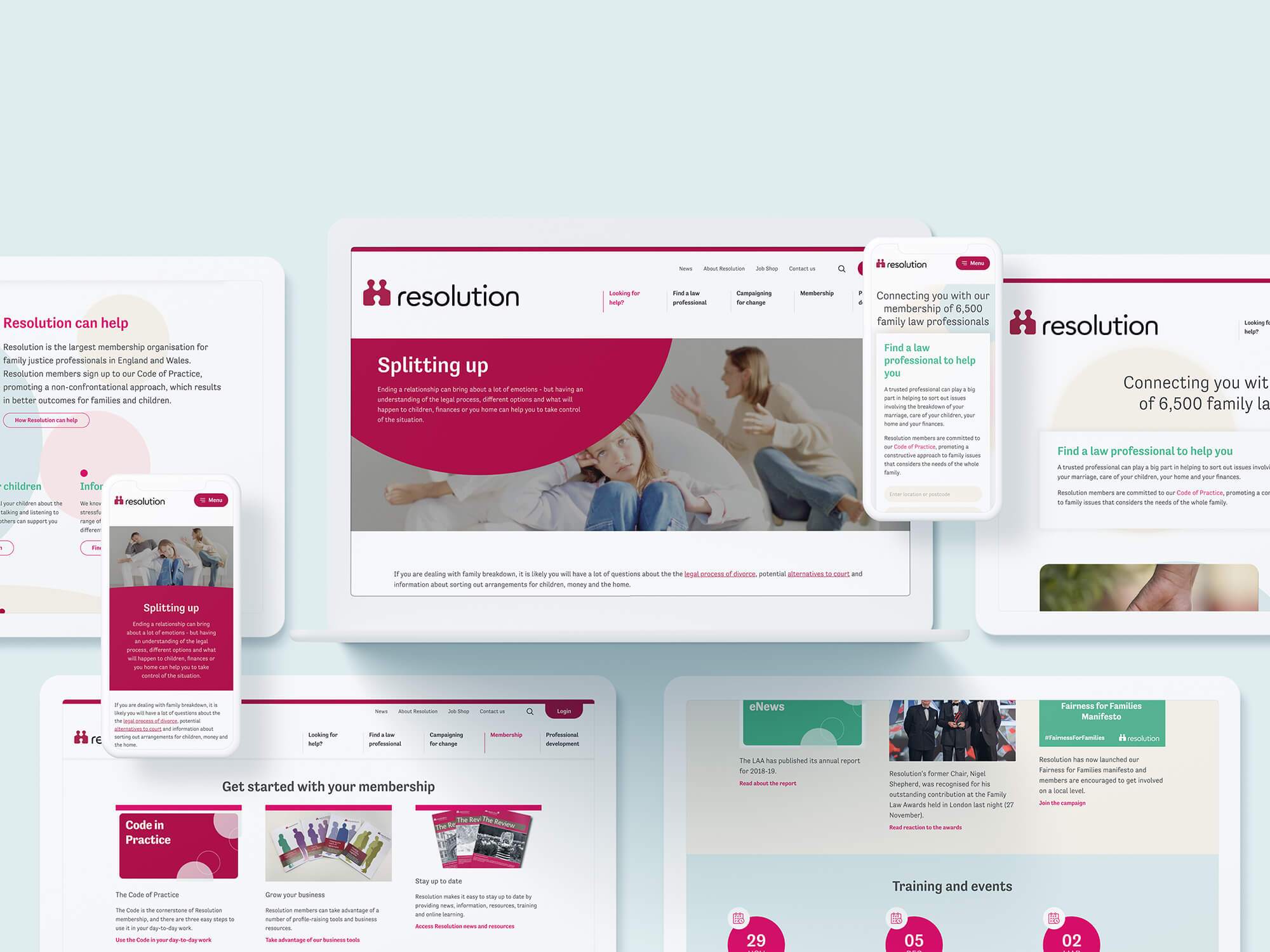
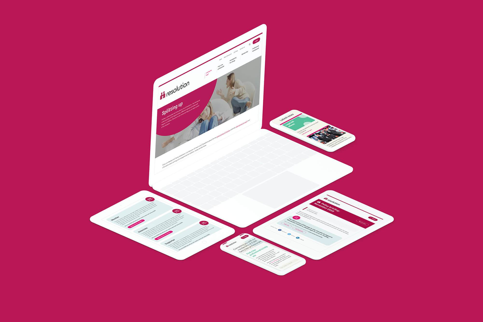
Key landing pages from Resolution's new site
Resolution’s new site combines technical complexity with careful design thinking.

The brief

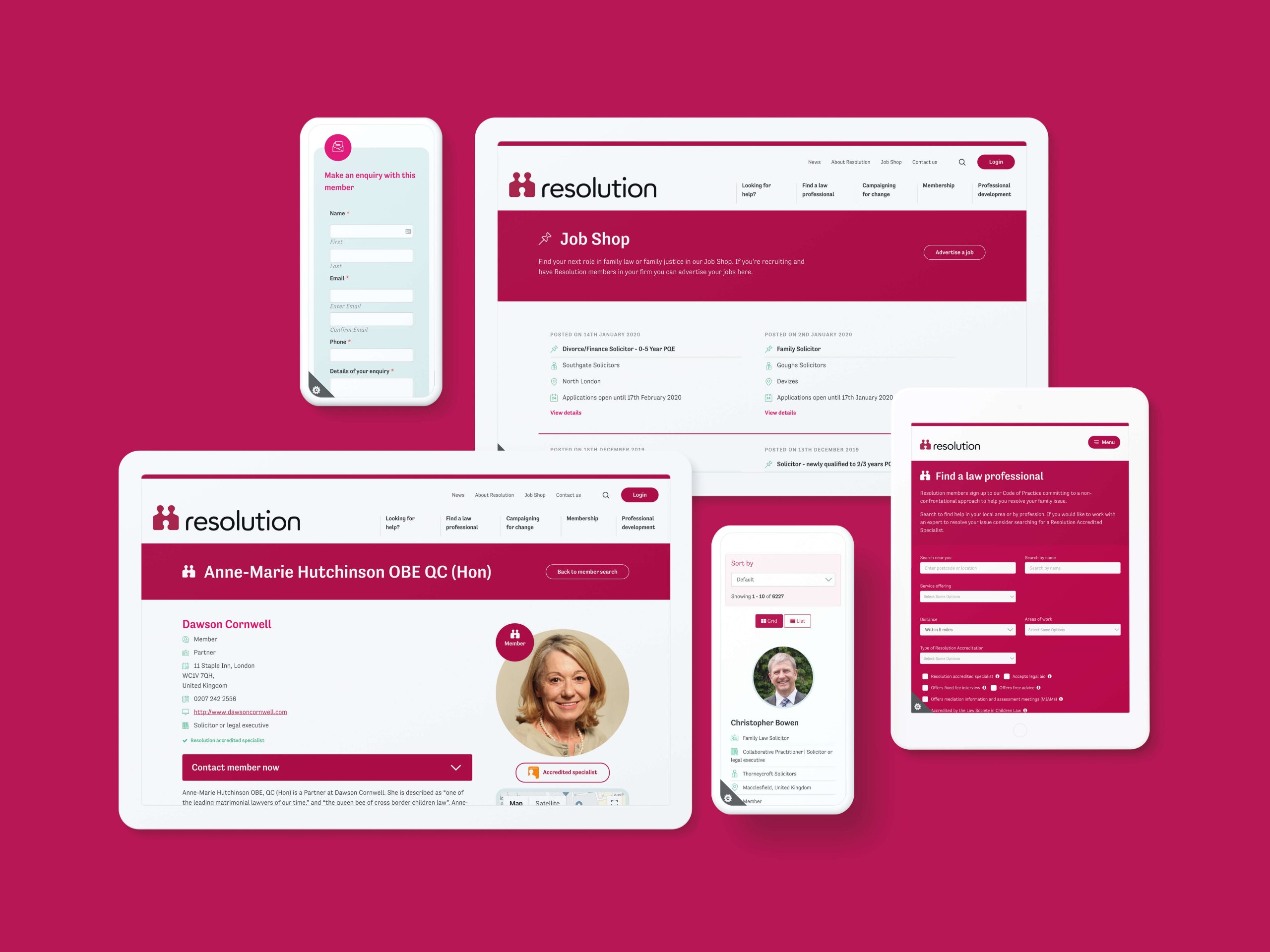
Resolution’s needs were complex. From the membership side, the site needed to incorporate an online joining process, with associated profile moderation and publishing. Their extensive shop needed both member and non-member products, and their events had both online and offline elements.

The member search needed to be clear, logical and inclusive, allowing users to easily find the law professional matching their needs. With numerous resources across multiple topics and reams of associated information, the Resolution team needed a blend of flexible components and well organised filtered listings underpinned by robust taxonomies.

Alongside these technical requirements, it was clear that Resolution also needed a visual identity and colour palette tweak, to something evocative of a caring organisation where members “always have a box of tissues to hand”.

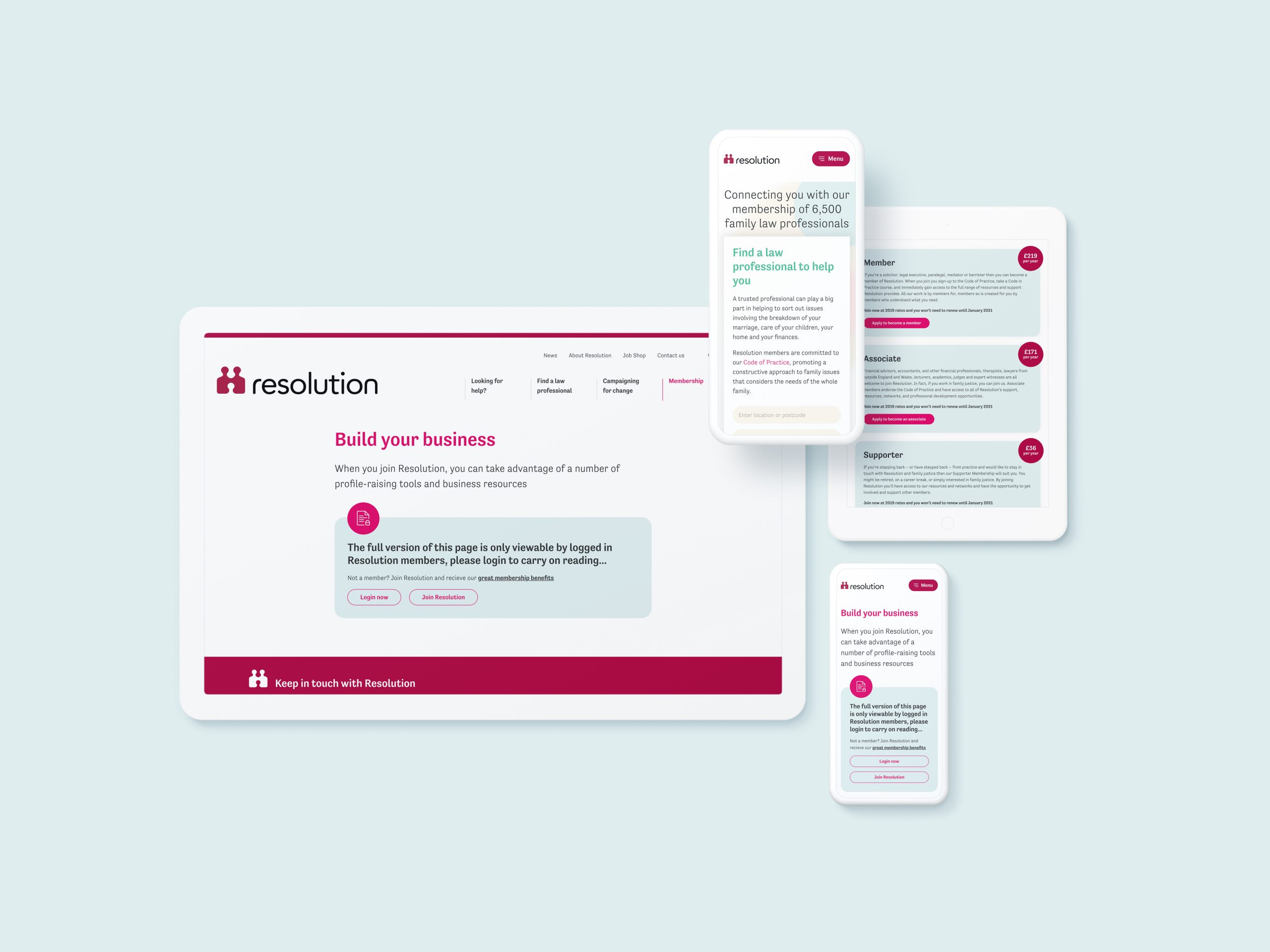
Resolution's shop and lawyer profiles on multiple devices
We reviewed and tweaked both Resolution’s visual identity and colour palette.

The process

We began with an in-depth discovery phase that centred on untangling the over-complicated technical specification Resolution had been provided by their previous agency. We worked with their team to understand what key templates were required for the new site and define the associated wireframes. We also reassessed the initial User Experience work and incorporated our own research into the process.

We challenged the draft homepage hierarchy, which we felt was too member focused. Users in a state of anxiety or crisis will have a much shorter attention span than motivated members who know Resolution well – therefore, the IA hierarchies and design approach needed to be orientated around these vulnerable users.

Our design review also revealed that Resolution had a disparate look and feel across their assets, including print and other channels. Hence, we incorporated a typography and brand tweak into our initial project process, defining the fonts and colours that would best represent Resolution’s brand personality.

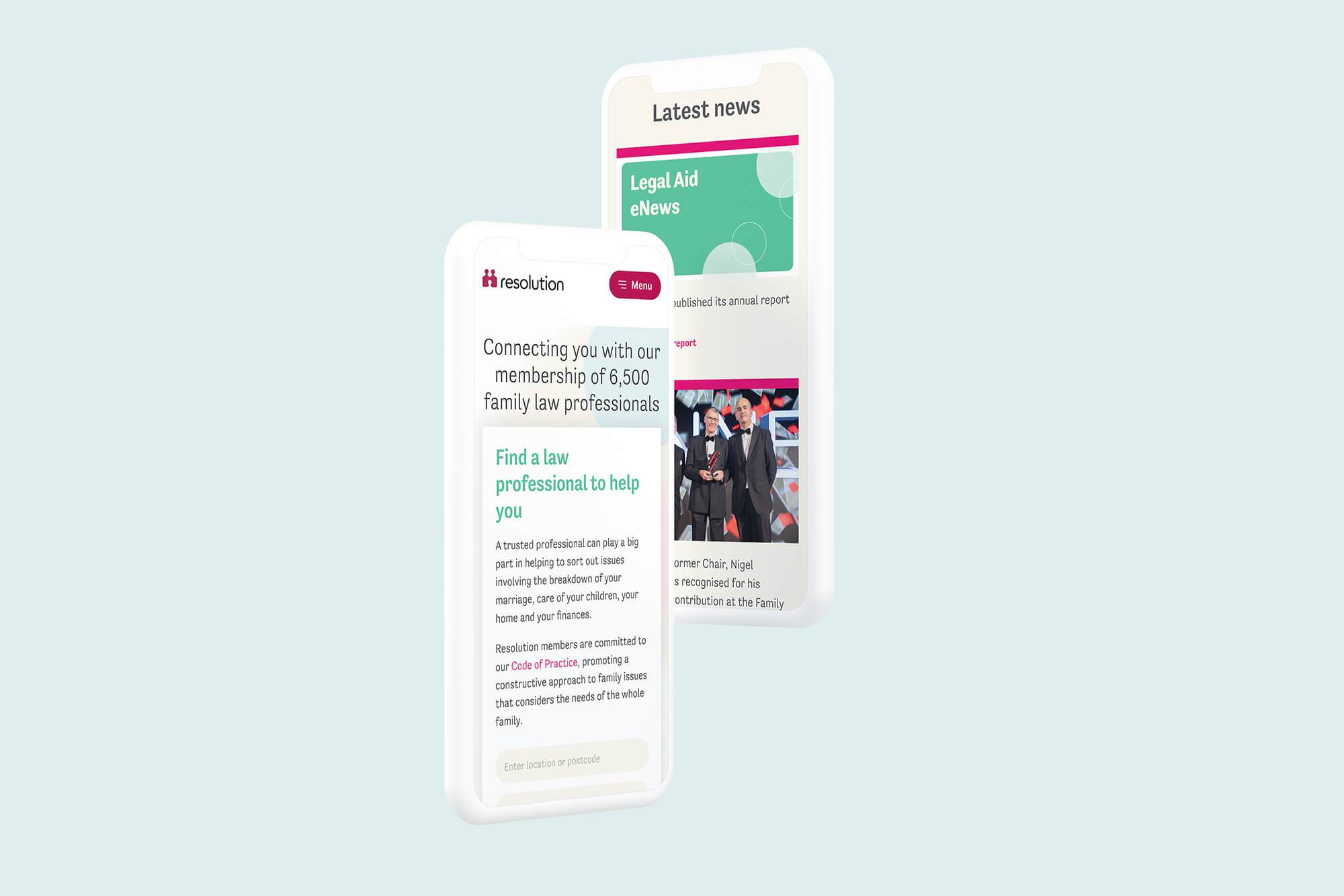
Mobile only view of Resolution's new site
Resolution's new site as it displays on mobile and tablet devices
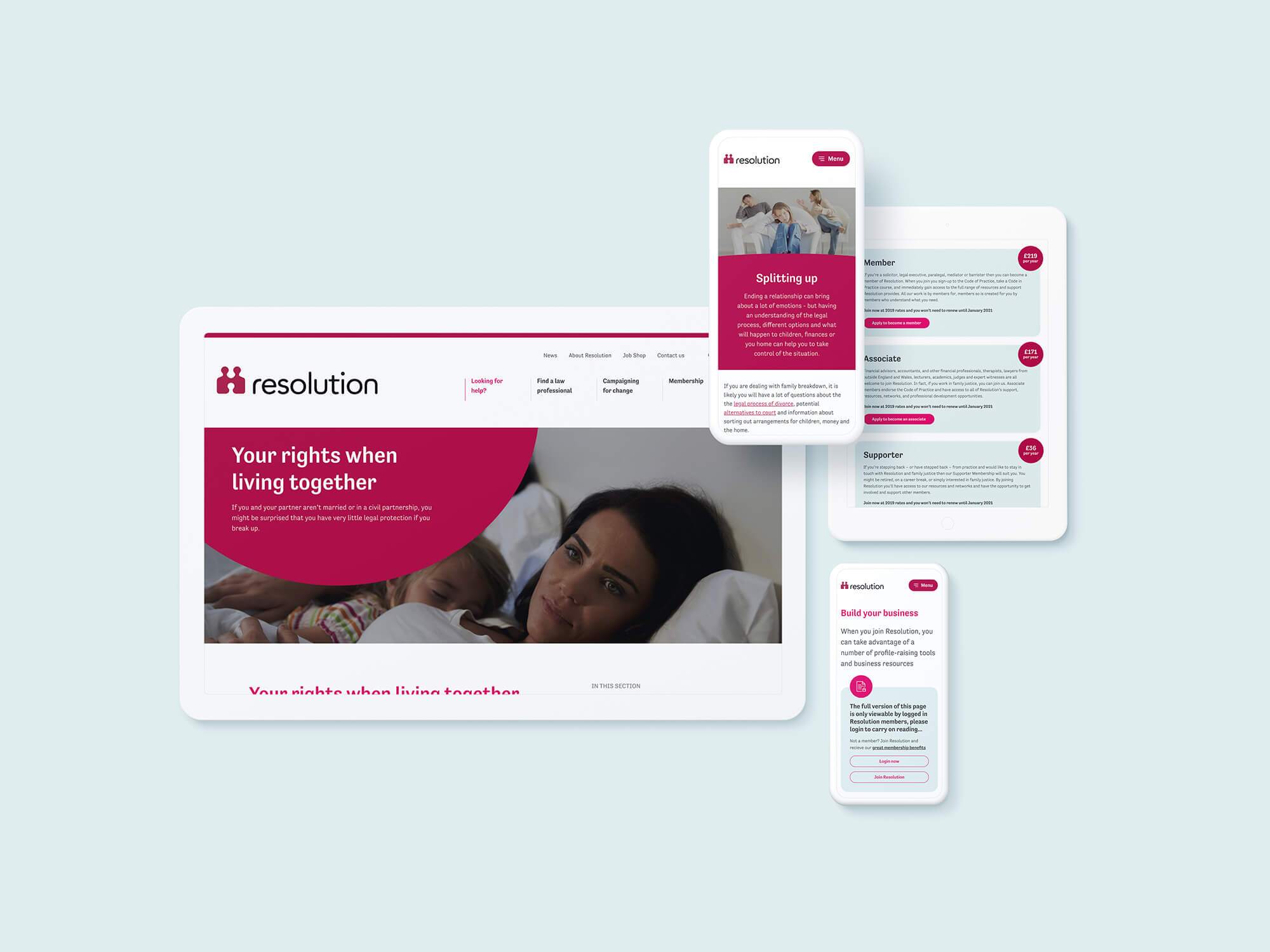
Resolution's new site as it displays on desktop and mobile
Resolution's new site is optimised for both desktop and mobile

The solution

We stripped back Resolution’s deep, dark red – which can have negative associations of anger or error – preferring to emphasise the calmer, friendlier pastel colours that they had used in certain communications. The circles on the homepage fade to create a soft edge as you scroll down, creating a subtle, almost meditative effect. Users are gently encouraged to engage with the organisation and get an immediate sense that Resolution and its members are approachable, warm and supportive. Our choice of Tenso for typography is friendly, while retaining the clarity and professionalism required by a membership organisation in the legal field.

We paid particular attention to the site’s key pieces of functionality, such as the “Find a law professional” search, applying clear type and design hierarchies in order to represent complex information in a simple and easily digestible way. We designed modern icons for additional clarity and applied best practice standards to contact forms. As a result, the design steps back, allowing users to read and understand the content without having to spend time or energy fighting to find key information.

Key landing pages from Resolution's new site
The site presents a wide range of information in a clear, legible way

We also randomised the law professional listing for inclusivity and equality, and provided both simple and advanced search options, prioritising users who might feel overwhelmed by too much choice.

From a technical side, once we had re-specced the project, we suggested Woocommerce for Resolution’s shop and events requirements, implementing a bespoke payment process for membership sign-up. The various listings are cross-linked using careful sitewide tagging, while calls to action and related content components offer both end-users and members numerous pathways through the site.

The large site required six months of content population from the Resolution team, who juggled internal stakeholder requirements and complex taxonomies with finesse. Claire and the team were fantastic to work with throughout the project, creating a genuine partnership with us that’s set to last many years.

Visit the site

Results

94%

increase in unique page views

81%

increase in time on page

83%

increase in page entrances

Resolution law icon
“A truly heartfelt thank you to Fat Beehive for their work on the - now really rather stunning - Resolution website. It was a complex project, and we weren’t always the simplest of customers to work with (or get a decision out of) but we are very, very happy with the result of everyone's hard work.”
Claire Easterman, Operations Director, Resolution

Get in touch

Speak to us about your project, get a quote