Delightful Ethical Digital
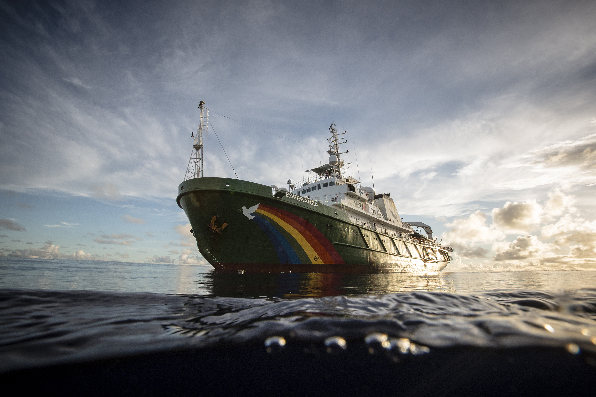
The Greenpeace ship Esperanza continues on an expedition in the Indian Ocean to peacefully tackle unsustainable fishing.

Greenpeace UK

Dynamic new site for the UK’s fearless environmental charity

How we helped

The challenge

Greenpeace. The name alone evokes a world-renowned organisation that fearlessly stands up for environmental issues in the face of multiple challenges. However, their old site was visually dated, struggled to show off their unique, powerful imagery and videos, and wasn’t connected to their other, more dynamic channels. 

There were clear gaps in user tracking capabilities, meaning that the team lacked crucial information on site performance and user interaction with key elements. Following investment in extensive email campaigning and social media, the website was the final piece of the puzzle to help Greenpeace reach their full digital potential.

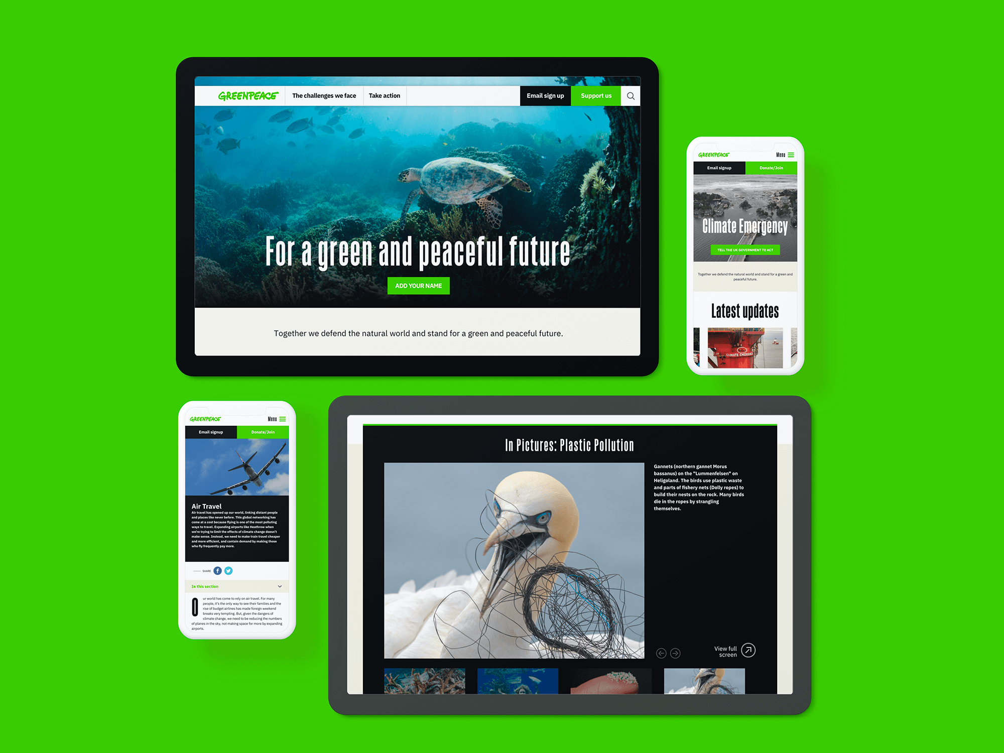
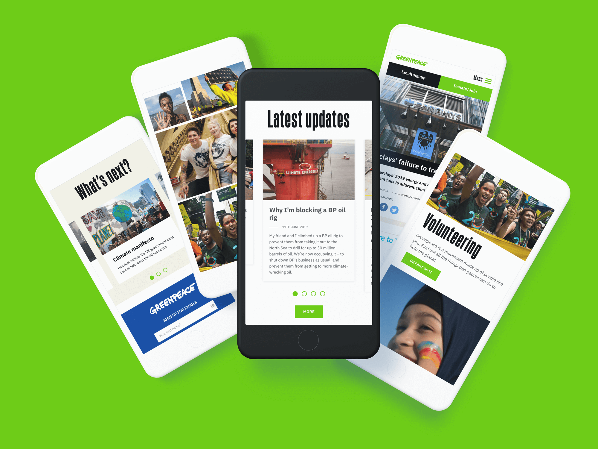
Greenpeace site shown on different devices
Greenpeace's new site allows the team to showcase their fantastic assets

The brief

The climate crisis is the biggest existential threat facing humankind. While the scale of the problem cannot be overstated, Greenpeace is aware that individual supporters engage with the issue in a range of different ways: from the occasional meat-free Monday to a willingness to participate in non-violent direct action. Therefore, the new site needed to meet audiences’ very diverse needs, while driving action and inspiring hope with energising content. 

Greenpeace’s team needed the flexibility to create a range of layouts to match this content, whether that’s short, punchy campaign pages, or more editorial style long-form thought pieces. Seamless integration with their direct marketing platform was vital, with well-mapped user journeys throughout the site.

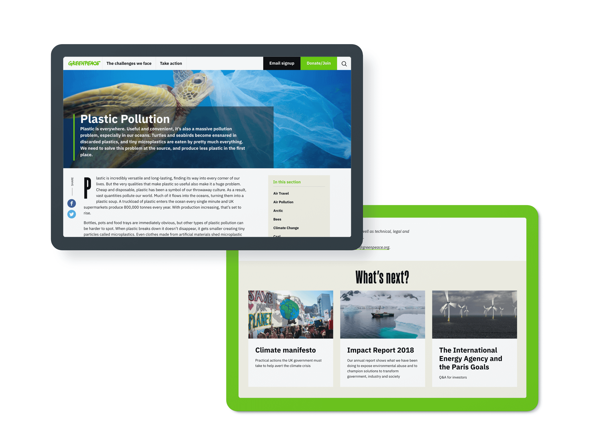
Different page designs for the new Greenpeace UK website
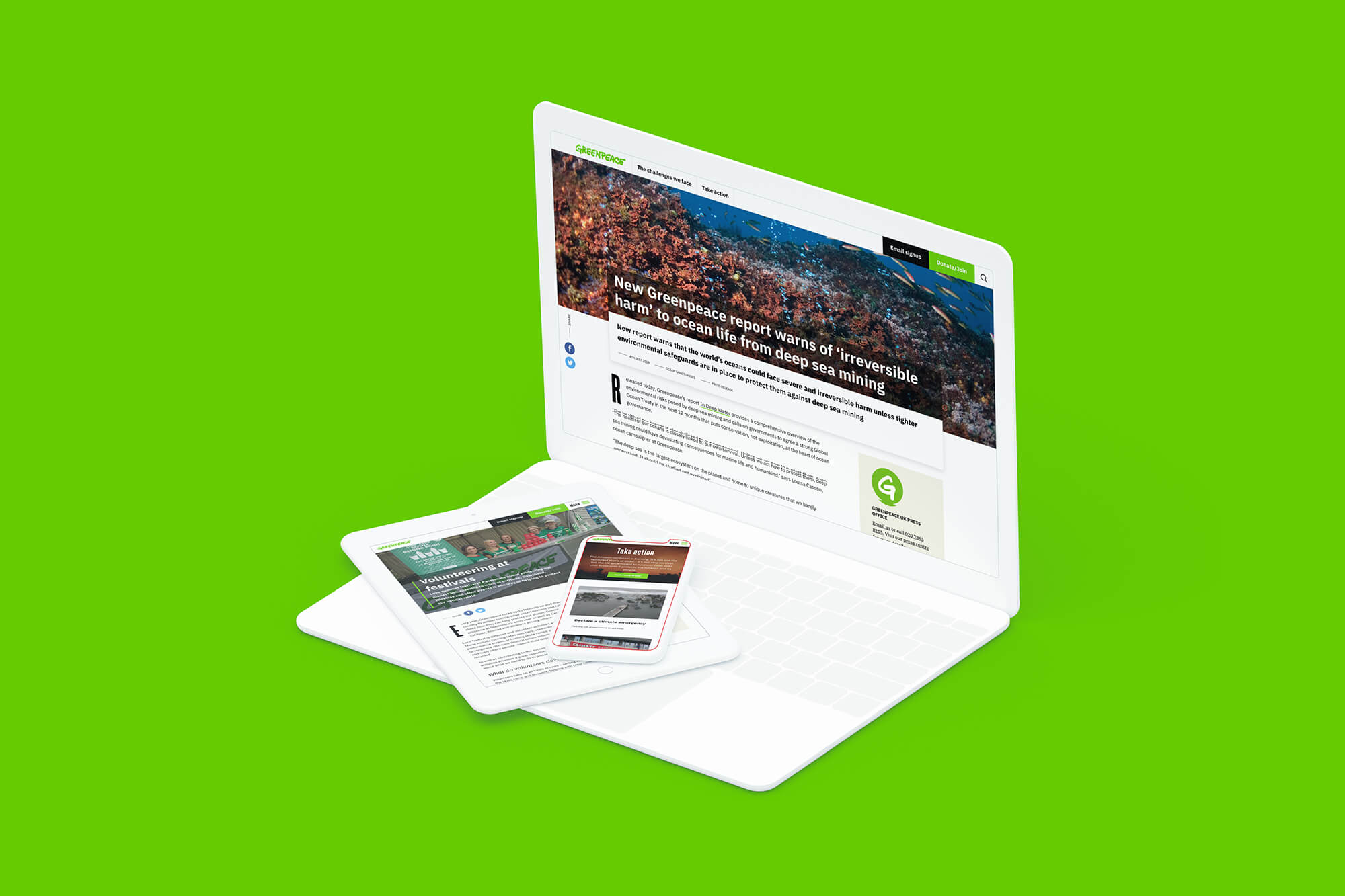
Greenpeace's site on a laptop with mobile and tablet on the keyboard
The 2019 Greenpeace UK website shown on different devices
The design is fully responsive, ensuring great experiences for all users on different devices

The process

We kicked off the project by deeply investigating Greenpeace’s audiences and marketing strategy, turning this research into user personas and user journeys. Then through UX workshops, we created a pared-back site structure and homepage content, validated with online surveys and involving multiple internal stakeholder groups.

As you’d expect in such a high-profile organisation, there were many strong voices and competing priorities, but we were able to facilitate some healthy discussion and, importantly, arrive at a consensus. Our User Experience research then formed a basis for our design thinking, as did our team’s background in content, editorial work and behavioural science.

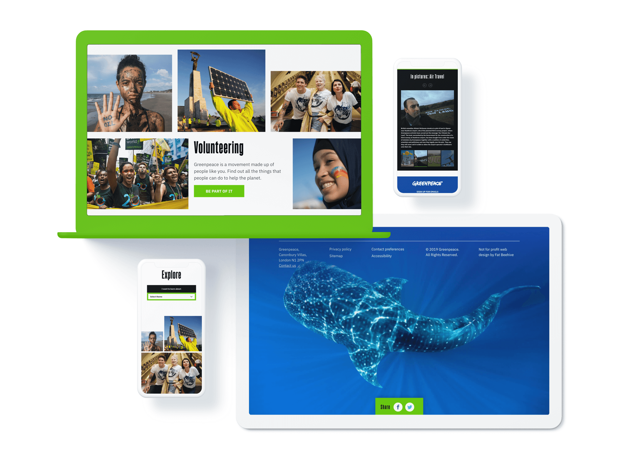
2019 Greenpeace website as it displays on mobile devices
The site has clear pathways for users to understand the issues and take action

The solution

Our Head of Creative often uses the quote “If I’d had more time, I’d have written a shorter letter” (attributed to Blaise Pascal), as it nicely sums up how it can be more difficult to make a design look simple. This was certainly the case with Greenpeace. They had multiple strong campaign identities and an overall brand closely associated with the symbolic and powerful colour green, but their messaging lacked visual unity.

While Greenpeace wanted their new site to convey their vibrancy, urgency and irreverence, we also added ‘awe’, ‘hope’ and ‘action’ to the guiding principles. Building from our strong UX discovery phase, we simplified the main navigation to just two items and two calls to action, and stripped back the colour palette to only green, black and white to allow the organisation’s incredible imagery to really shine. In combination with our choice of the forceful headline typeface Sorren and the clarity of Plex for body copy, we had the building blocks for a strong and simple UI design.

Different page designs for the new Greenpeace UK website
The new site allows Greenpeace to maximise their content

We designed and built a dynamic mix of components – including galleries, in-page calls to action, related content promos and accordions – so the Greenpeace content team can keep their pages fresh and varied.

We also defined and implemented a comprehensive tracking plan based on a series of agreed KPIs. This provides an excellent basis to really understand how users interact with the site, helping Greenpeace modify forms, restructure calls to action and implement an agile content strategy in direct response to users’ needs.

Visit the site

Results

Greenpeace’s site now reflects the urgency needed to tackle our climate emergency, with simple calls to action, clear hierarchies of typography, non-distracting design and integrated user journeys. Working with Greenpeace was a long-held dream for many of us at Fat Beehive, and we’re proud to have played our role in amplifying their message to help protect the only home we have: the Earth. With goal tracking in place across the site, we’re looking forward to iterating and improving it to make sure this message retains the clarity and force it deserves.

Get in touch

Speak to us about your project, get a quote