The challenge
The merger brought together two charities with a shared purpose but different histories, audiences and ways of working. The new organisation needed to define itself clearly in a crowded and often confusing landscape, where multiple hospital-related charities and organisations already exist.
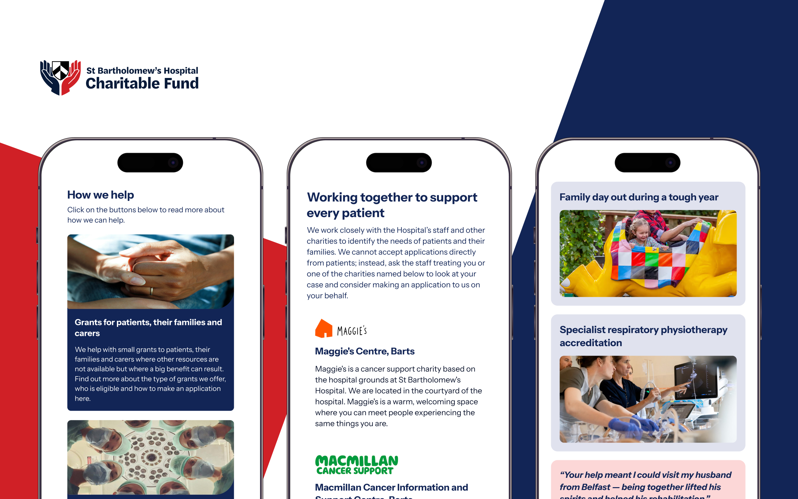
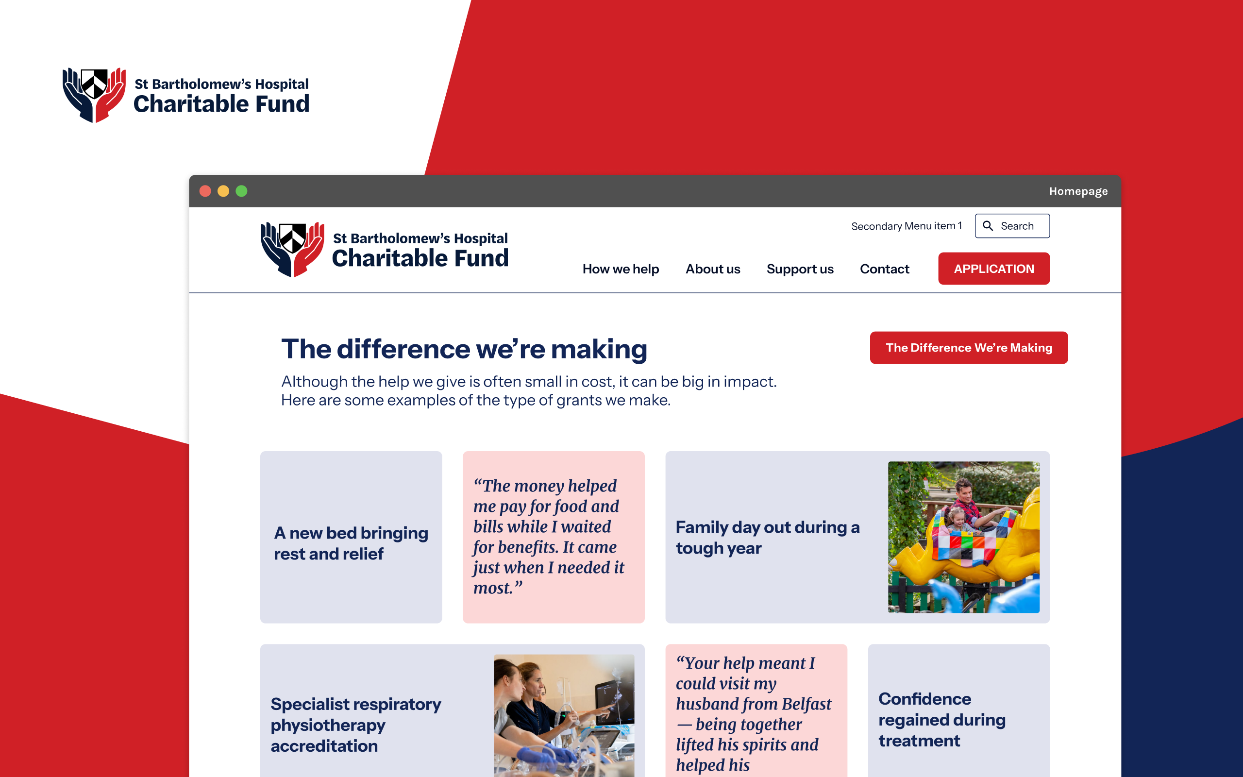
At the same time, its work is inherently practical and human. The Fund provides small but meaningful grants – from travel costs and essential household items to support for staff training and development. For many people, these interventions come at critical moments, when clarity and ease of access really matter.
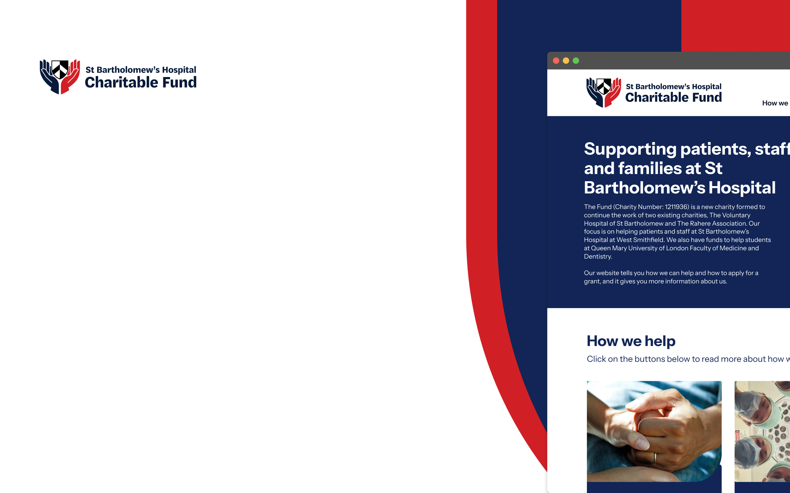
That shaped our approach from the outset. The brand and website needed to feel:
- clear and easy to understand
- human and approachable
- grounded in real-world impact
And above all, they needed to remove friction – helping people move quickly from understanding to action.
We started by working closely with the team to figure out what the organisation should feel like – not just how it should look.
One of the challenges was getting the balance right. St Bartholomew’s has a huge amount of history behind it, and there was a temptation to lean into that. But go too far and it risks feeling formal or distant, which doesn’t reflect the day-to-day reality of the Fund’s work.
Some of that heritage – including references like the Wakering Shield – helped shape early thinking. But it was clear quite quickly that the new organisation needed its own identity, rather than something that felt inherited.
As the work developed, a simpler idea started to cut through. This is a charity that offers practical help at the point it’s needed. Not big gestures – small things that make a real difference.
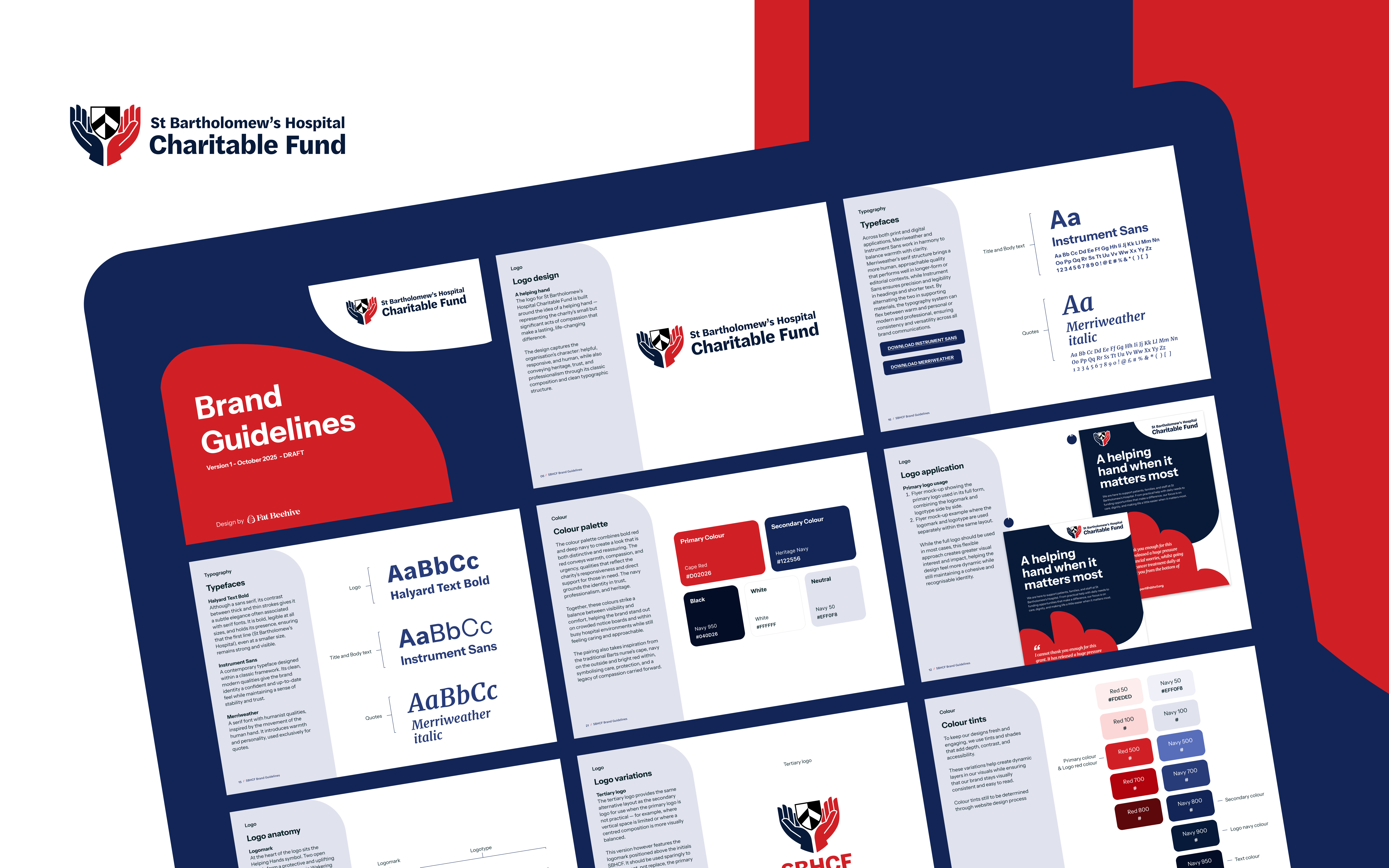
That led us to the idea of the “helping hand”. It’s a straightforward way of describing what the Fund does, and it gave us something to build from visually as well.
From there, the identity came together in a fairly stripped-back way – keeping things clean, readable and easy to use rather than over-designed. The aim was something that feels human and dependable, without tipping into anything too worthy or overly polished.