Delightful Ethical Digital

Money Ready

Creating financial confidence

Read the Money Ready case study

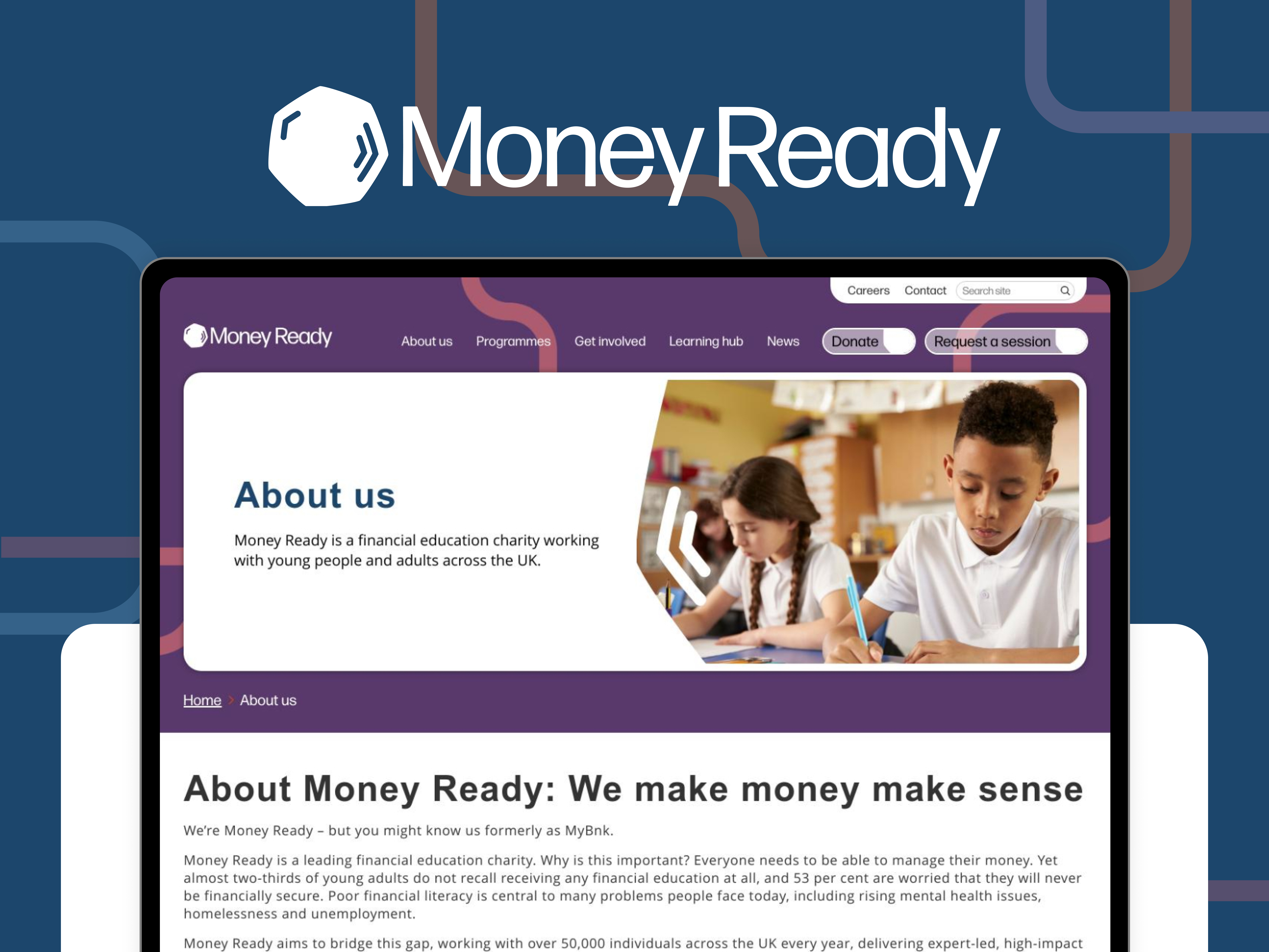
Money Ready is a national charity on a mission to create a financially confident and capable generation, and in order to achieve that they needed a bold new digital identity. Through expertly designed programmes and workshops, they reach over 40,000 young people and adults each year – many of whom are facing complex life challenges, from care leavers and young people at risk of homelessness, to those in supported accommodation or rehabilitation settings.

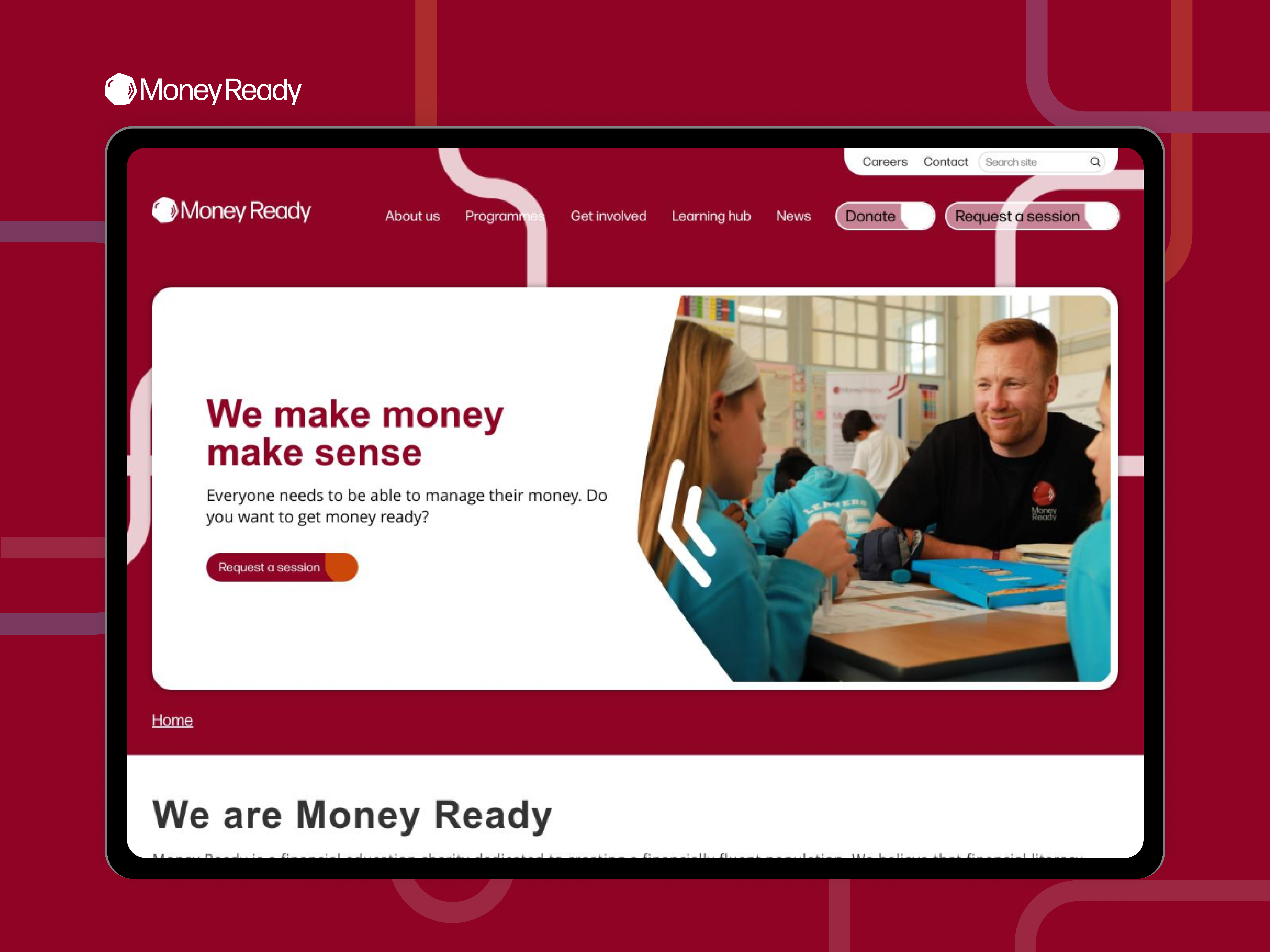
But despite their impact, Money Ready’s digital presence was no longer doing justice to the scale or ambition of their work. With a major strategy refresh underway and this name change on the horizon (they were previously called MyBnk), the organisation was ready to reposition itself at the forefront of financial education in the UK – and needed a new brand and website that would lead the way.

Our new logo design was inspired by the shape of a 50p coin

Rethinking the brand to reflect real impact

The old MyBnk brand had served them well, but it was showing its age. Stakeholders found the name confusing and the visual identity skewed too heavily towards younger children, despite the charity’s reach now spanning a much broader range of audiences – from educators and commissioners to vulnerable adults.

On top of that, the existing website was hard to navigate and lacked clarity around their core offer. It didn’t reflect their team’s professionalism or credibility, and limited their ability to respond quickly to user needs or strategic priorities.

Money Ready needed a digital partner who understood the sector, had experience working with evolving brands, and could bring strategic clarity as well as creative flair. Fat Beehive stood out for our collaborative process, flexibility, and deep understanding of mission-led organisations.

Streamlined user journeys are an integral part of the new site

A joined-up approach to strategy, branding and UX

We kicked off with a discovery phase that involved stakeholder interviews, brand and UX workshops, and an in-depth review of their goals and audiences. This unearthed three distinct user groups: delivery partners (commissioners, funders, schools), learners (young people and adults), and institutional supporters. Each had specific needs, and many had struggled to navigate the old site.

We restructured the site architecture from the ground up, streamlining user journeys and making it easy to find relevant programmes, access resources and get in touch. At the same time, our brand team developed a bold, refreshed visual identity – a modern logo, colour palette and typographic system that better reflected Money Ready’s maturity, credibility and ambition, while remaining youth-friendly and accessible.

The new logo combines the instantly recognisable shape of a 50p coin with contactless-inspired beams – a visual nod to both traditional and modern methods of payment. The colour palette draws directly from the tones of UK banknotes, subtly reinforcing the financial theme. Throughout the branding, we aimed to infuse as much ‘money’ as possible into the look and feel, while keeping it fresh, simple and distinctive.

The result strikes the right balance: serious enough to build trust with funders and institutions, but vibrant enough to connect with younger audiences. Crucially, it’s built to flex across print, digital and social content – giving the team full creative control.

We created a mobile-first platform that could grow alongside them

Building a website that works for everyone

The new WordPress site was built with flexibility in mind, using a block-based system that allows the Money Ready team to create and update pages quickly and easily. Content is now broken up with strong visual components: calls to action, testimonial sliders, impact stats, quotes, illustrations and photos all working together to keep users engaged.

Visitors can now understand what Money Ready does, who it’s for, and how to take action – whether that’s booking a workshop, donating, or signing up as a partner. We also created flexible landing pages tailored for campaigns, and built a mobile-first platform designed to grow with the organisation’s evolving needs.


A confident, user-friendly and future-proof platform

Setting the foundations for a bigger future

This wasn’t just a rebrand – it was a strategic shift in how Money Ready presents itself to the world. The new brand and website lay the groundwork for continued growth, providing the tools, structure and flexibility the organisation needs as it enters its next decade.

As the full brand rollout continues, the new website stands as the centrepiece of that transformation: a confident, user-friendly and future-proof platform that reflects both where Money Ready is now – and where it’s going next.

If you’re looking for a brand new digital identity we’d love to hear from you.

www.moneyready.org

Get in touch

Speak to us about your project, get a quote