Delightful Ethical Digital
CLAPA - a user-led charity website redesign, grounded in research

CLAPA

Building digital confidence

Read the CLAPA case study

The challenge

CLAPA has been our client for more than a decade. Over that time, their website had evolved organically, shaped by changing needs, new content and incremental improvements. But by 2024 it was clear that the site was no longer doing justice to the confident national charity CLAPA had become, or the community it supports.

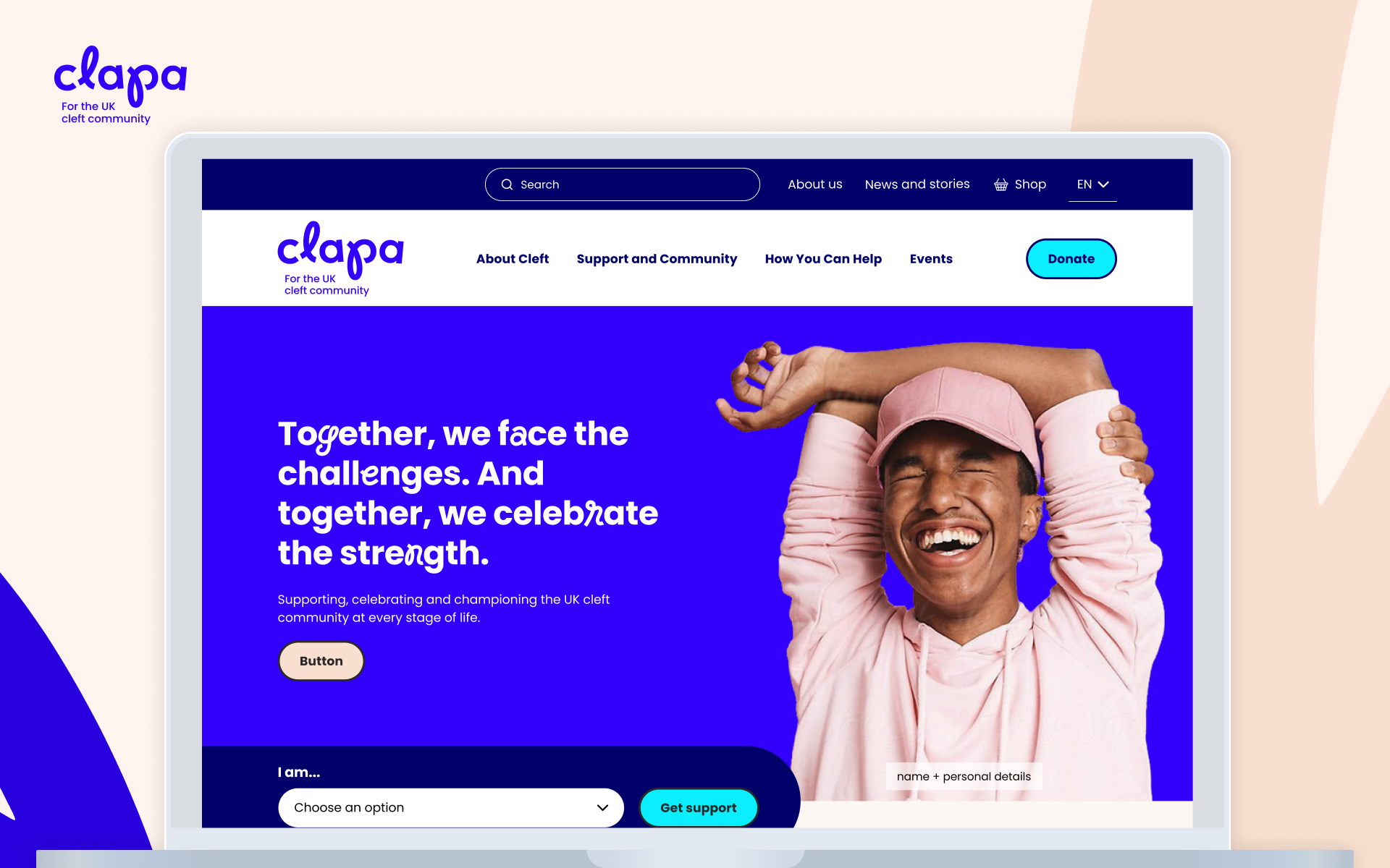
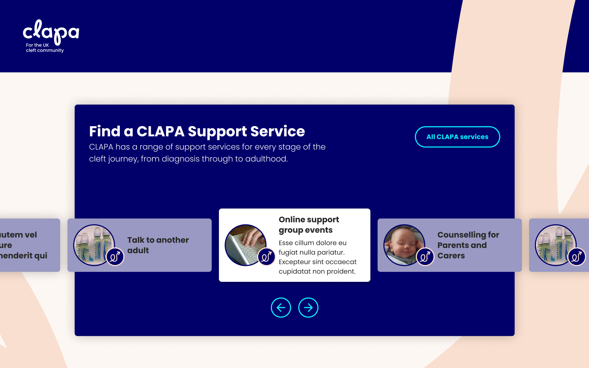
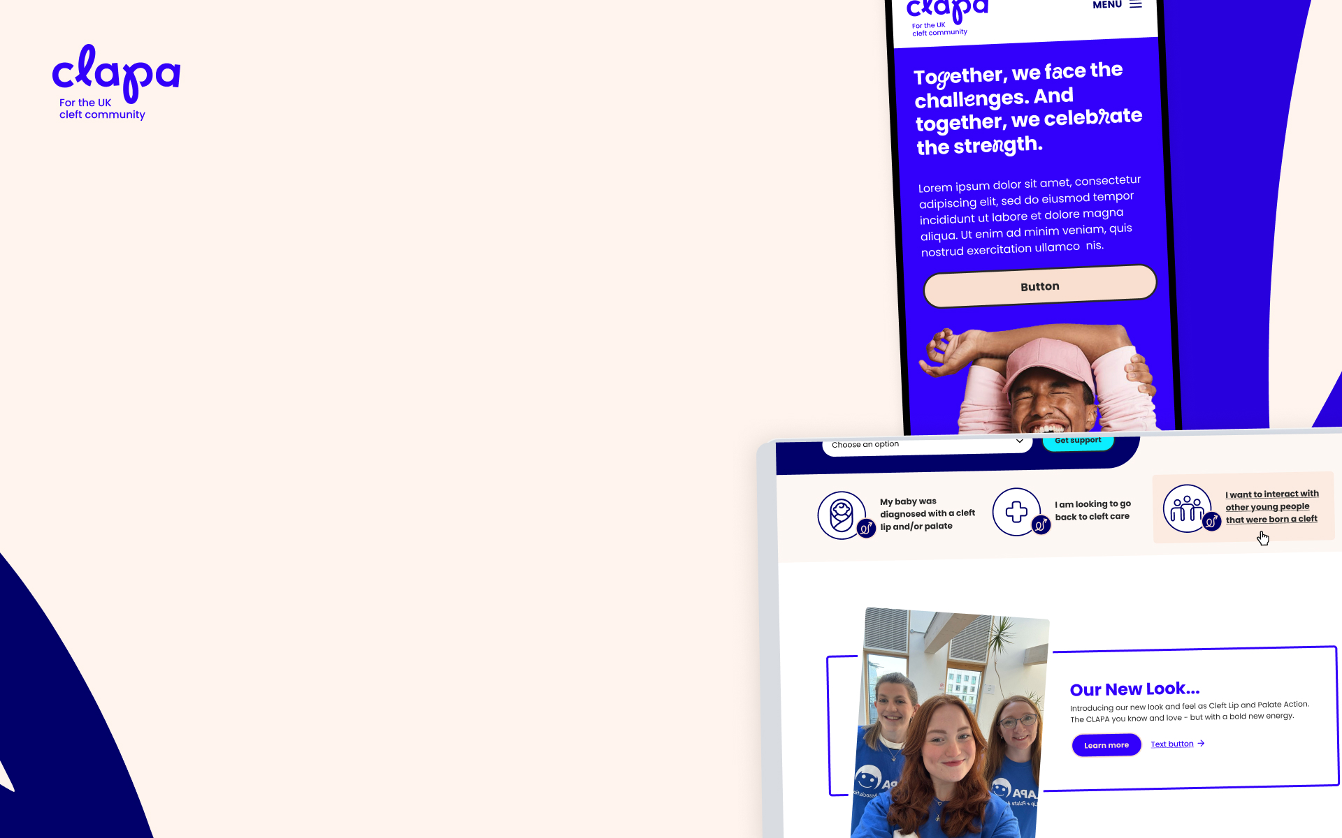
This wasn’t simply a visual refresh. It was a user-led charity website redesign, grounded in research and informed by those who need its services the most. The structure had become cluttered, key audiences weren’t always sure where to start, and the experience didn’t consistently reflect the warmth, reassurance and authority that sit at the heart of CLAPA’s work. While the organisation had recently undergone a brand refresh, there was a clear need to translate that new identity into a confident, usable digital experience.

What began as a conversation about smaller improvements quickly became an opportunity to rethink CLAPA’s digital home in the round. In addition, CLAPA had taken the decision to change their acronym from ‘Cleft Lip and Palate Association’ to ‘Cleft Lip and Palate Action’ as they wanted to show how they’d grown from a volunteer-led association into a confident national charity acting on behalf of their community, who were committed to rewriting the story of cleft in the UK. It was key that the new site reflected this shift in messaging as well.

The CLAPA website homepage showing clear navigation and welcoming imagery, reflecting the charity’s role as the UK’s national cleft community support organisation
Translating CLAPA’s refreshed brand into a clearer, more confident digital homepage

A user-led charity website redesign

CLAPA supports people born with a cleft lip and/or palate, as well as their families, carers and professionals. Their audiences are diverse, and many arrive at the website at emotionally sensitive moments in their lives – often looking for reassurance, clarity and support rather than dense information.

Through a structured programme of user testing and discovery work, we spoke directly to people with a cleft condition, parents and carers, and healthcare professionals to understand how they were using the existing site and where it was falling short. Using one-to-one interviews, task-based testing and early structural prototypes, we observed how different audiences searched for support, what language they responded to, and where they hesitated or lost confidence. These sessions gave us clear, practical insight into what needed simplifying, what needed surfacing earlier, and how tone and structure could work harder to provide clarity at emotionally sensitive moments.

The results of this user testing and discovery work, showed that the website needed to do several things well, and do them quickly:

  • help people understand CLAPA’s role and support offer
  • create a calm, welcoming first impression
  • guide users confidently to the right next step
  • balance practical information with empathy and care

This wasn’t about adding more content – it was about making the existing content work harder, in a way that felt both human and accessible.

Screenshots or visuals from user research activities, showing feedback sessions and user flows that informed the site’s structure and tone — the foundation of the user-led redesign
User testing shaped the site’s structure, ensuring navigation reflects real audience needs

Our approach

As with all our work, the project began with focusing on the users. The research and user testing we carried out helped us understand where people were getting stuck, what they found reassuring, and what made them feel confident as they moved through the site.

Working closely with the CLAPA team – and alongside the new brand work – we redesigned the website to prioritise clarity, structure and tone. Our role was to bring the brand to life – digitally. We achieved this by integrating these new visual elements into a website that was coherent, instinctive to use, and emotionally compelling.

What changed

Rather than adding additional content or functionality, we focused on clarity, confidence and tone. Our aim was to make the site easier to navigate, more reassuring for first-time visitors, and better in sync with why people want to visit the website, given that nine times out of ten they’re looking for support, guidance and reassurance that they’re landed in the right place.

Up until now the user experience was shaped by years of organic growth:

  • Content-heavy pages that were difficult to navigate
  • Unclear entry points for different audiences
  • A structure that didn’t instill reassurance or confidence
  • An experience that felt more informational than welcoming

Now, the site offers a clearer, more natural user journey:

  • Clearer routes for people at different stages of their journey
  • A more confident, welcoming tone throughout
  • Improved structure and signposting across key sections
  • A website designed around community needs, not just content volume

The result is a site that feels calmer, clearer and more personable, while still retaining the wealth of information CLAPA’s audiences rely on.

A visual showcasing the live CLAPA website on different devices or screens, representing Fat Beehive’s capability in designing charities’ digital experiences.
The redesigned pages deliver a calmer, more intuitive experience for people seeking support

The outcome

The new website is now live, and feedback from the CLAPA team has been overwhelmingly positive.

“We’re all seeing it live on our end and it looks beautiful! Thank you so much for your help; we’re delighted with the new website.”

Anna Martindale, Digital Product Manager, CLAPA

“The brand new website you’ve developed for us brings CLAPA into the modern age and oozes the character, warmth and vibrancy of the new brand and provides a 100000% better digital experience for our supporters and service users.”

– Nick Ford, Head of Comms and Marketing, CLAPA

A partnership built on trust

This website rebuild is a perfect example of our focus on why long-term client partnerships matter. Having worked with CLAPA for over ten years, our deep understanding of their audiences, challenges and ambitions informed everything we did. This meant we weren’t having to start from scratch – we could build on years of insight, learning and shared experience. 

What started as smaller pieces of work grew into a full rebuild grounded in trust, collaboration and an understanding of what “good” meant for CLAPA and its audiences.

This project brought together stakeholders across CLAPA, alongside external partners involved in the brand refresh. Our role was to translate that wider work into a coherent, confident digital experience – ensuring that every decision was guided by user need and informed by our long-standing knowledge of the organisation.

This combination of continuity, collaboration and clarity allows us to create digital platforms that not only look great, but genuinely support the people who rely on them.

Drop us a line and find out how we can help strengthen your digital presence.

www.clapa.com

Get in touch

Speak to us about your project, get a quote