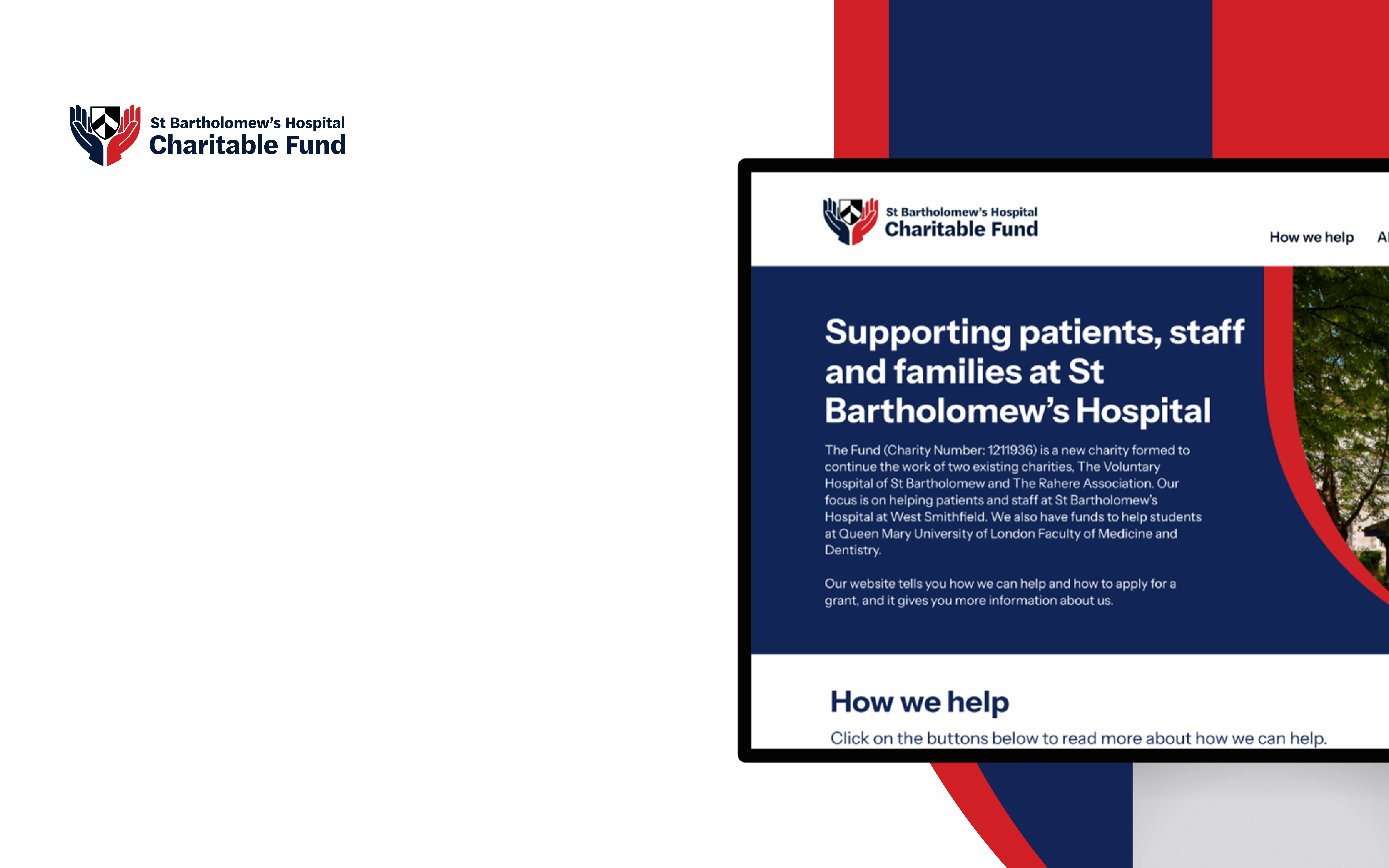
Designing for clarity and confidence
The design follows the same thinking as the brand – keep it clear, keep it usable, and don’t overcomplicate things.
We avoided long, dense pages where possible, breaking content up so it’s easier to scan and take in. Headings do a lot of the work, and calls to action are kept obvious without shouting.
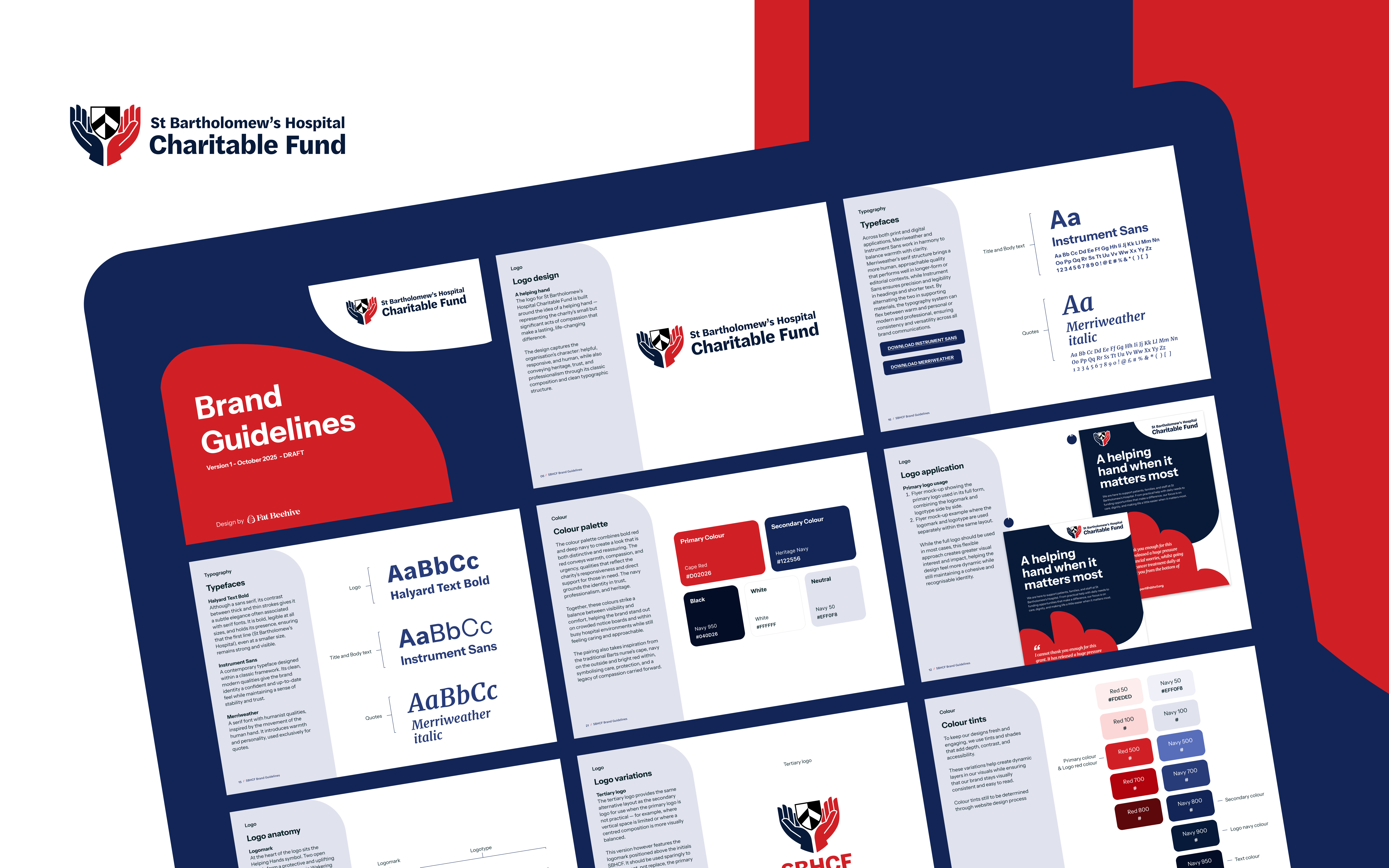
The component system gives the team some flexibility too. They can highlight key information, guide people through a page, and update things over time without everything starting to feel cluttered again.
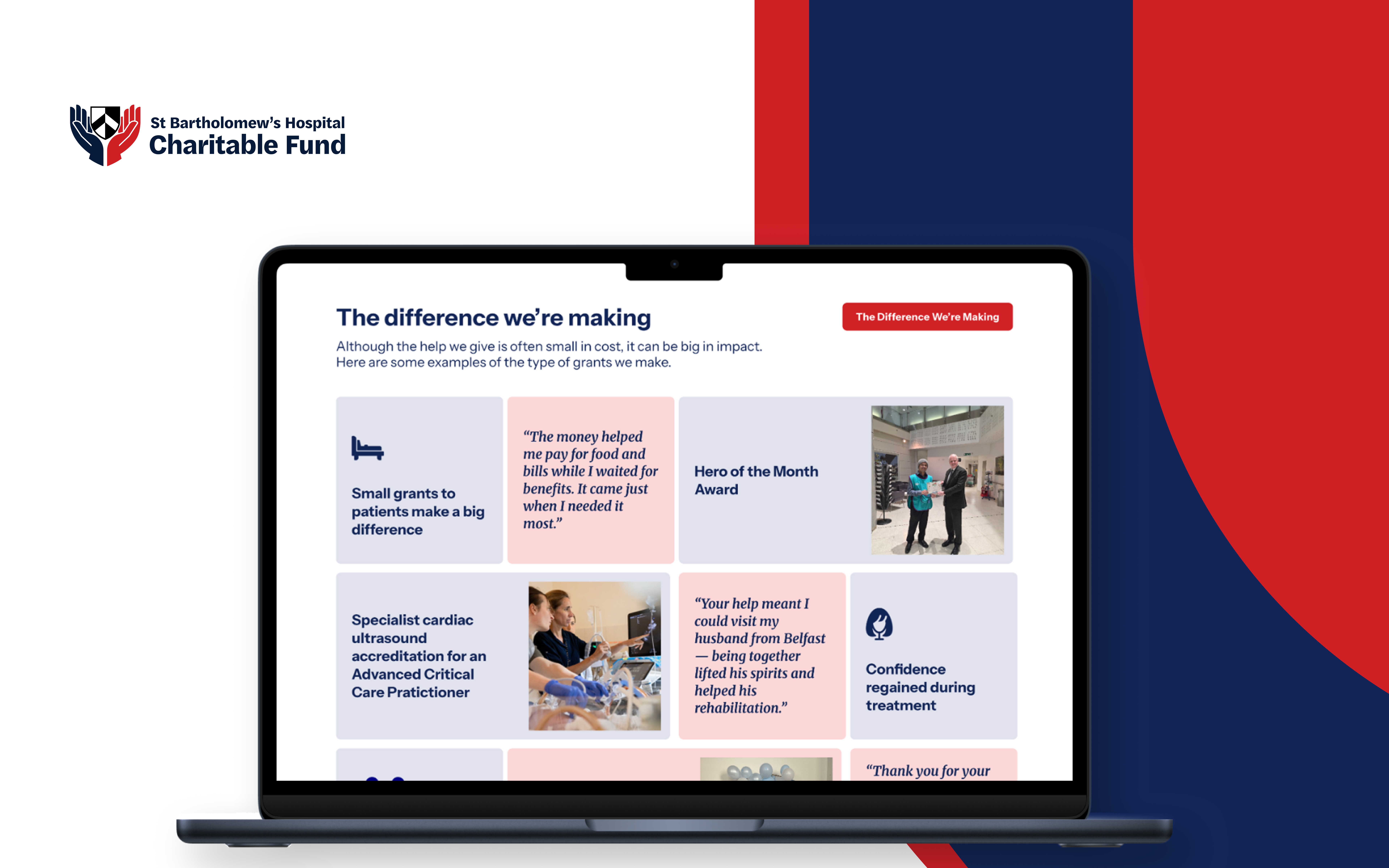
Case studies and real examples are used to show the kind of support the Fund provides. They’re simple, but they help make the work feel tangible rather than abstract.
Accessibility runs through all of this. Not just in terms of standards, but in how easy the site is to read, understand and move around – especially for people who may already be dealing with a lot.
The result is a brand and website that work together from the outset – clear, approachable and grounded in the realities of the Fund’s work.
“We are very pleased that the website is now live and we are really happy with how it looks and works! Many thanks to everyone at Fat Beehive who worked on, and supported this.”
– Lizzie Clarke, Executive Secretary, St Bartholomew’s Hospital Charity Fund
For a new organisation, that clarity matters. It helps people quickly understand what support is available, and gives them the confidence to take the next step, whether that’s applying themselves or helping someone else to do so.
Just as importantly, it gives the team a platform they can build on – one that reflects who they are now, and can grow with them as the Fund continues to develop.
Drop us a line to see how we can revitalise your brand.
www.sbhcf.org.uk