Delightful Ethical Digital
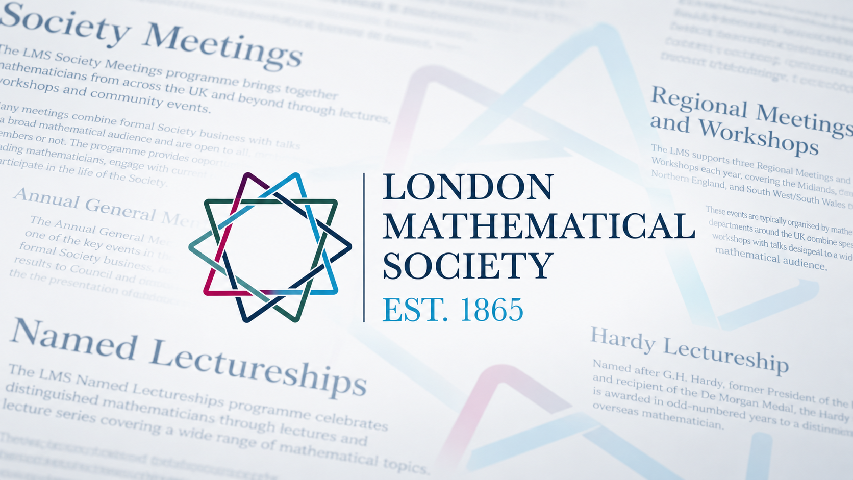
The London Mathematical Society logo featuring an interlocking geometric star design in teal, blue, and burgundy, displayed alongside website content about Society Meetings and Named Lectureships, with the establishment year 1865.

LMS

Making complex content clear

Read the case study

Finding the right words for mathematics

Website copywriting for membership organisations can be particularly challenging when there’s a lot of specialist information to communicate. Take the London Mathematical Society (LMS). It’s been supporting and promoting mathematics since 1865, and as the UK’s learned society for mathematics, its work spans research funding, publishing, events, education and support for mathematicians at every stage of their careers.

That’s a lot to communicate through a website.

Our relationship with LMS began with a detailed review of their existing Drupal website. We spoke to members, looked at how people used the site and identified where the navigation and content weren’t working as well as they should. That led to a rethink of the website’s structure, user journeys and design, making it easier for different audiences to find what they needed without the expense of a complete rebuild.

As that work progressed, LMS asked us to help rewrite some of the site’s most important sections. We’d already spent considerable time getting to know the organisation and its audiences, so we were well placed to tackle the copy too.
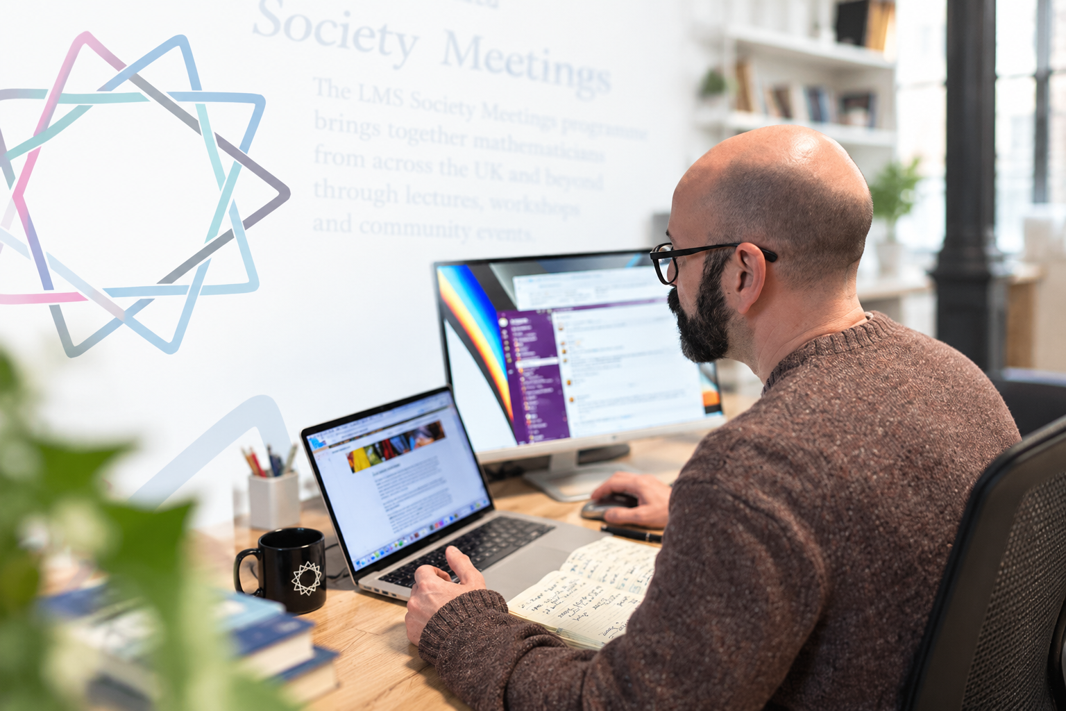
A bespectacled, bearded man works at a desk with a laptop and external monitor in an office.
Turning complex copy into something clearer, more accessible and engaging

Getting to grips with the detail

LMS works across a highly specialist field, so getting the detail right mattered just as much as making it easy to understand.

By the time we started writing, we had a good understanding of LMS and the people using their website. The challenge now was turning that knowledge into copy that made specialist information easier to find and understand.

Funding was a good example. LMS offers funding across UK research, early career development, teaching, international research, equality, diversity and inclusion, and a range of other activities.

Our job was to turn all of that information into a section that helped visitors quickly understand what was available and what might be relevant to them. The new copy works with the site structure, moving from an overview of the funding available into increasingly detailed information without expecting visitors to understand how LMS itself is organised.

When the structure changes, the copy has to change too

Events brought a different challenge.

LMS runs everything from Society Meetings and named lectureships to research symposia, early career activities and international events.

During the project, plans for this part of the website changed. Individual pages for many events would no longer exist, so the category pages needed to do much more than introduce an event and point elsewhere.

We revisited the copy so each category could stand on its own, giving visitors the evergreen information they needed while leaving dates and other time-specific details to the events calendar.

It’s a small example of a much bigger point: website copy and information architecture need to work together. Changing one often means rethinking the other.

The London Mathematical Society logo featuring an interlocking geometric star design in teal, purple, and dark blue colors, displayed alongside text reading 'London Mathematical Society Est. 1865' over a document about Society Meetings and Named Lectureships.
Making specialist mathematical content easier to understand and navigate

Finding the LMS voice

There was another balancing act running through the project.

LMS is a learned society with more than 160 years of history and an audience that includes academics and leading researchers. But its website also needs to work for students, early career mathematicians, teachers, partners and many others engaging with the Society.

The copy needed authority without unnecessary formality. Specialist language stayed where it was useful, but clarity came first.

By working across several areas of the website, we were also able to develop a consistent voice rather than treating each section as a separate piece of content.

Getting it down to one line

Our final task was perhaps the neatest illustration of the whole project.

After months spent getting to know LMS and understanding the breadth of its work, we were asked to help with the new homepage hero.

The brief? A single heading and one line of supporting copy that captured who LMS is and what it does.

We explored several approaches, including its position as the UK’s learned society for mathematics, its role in supporting mathematicians and the way it brings the mathematical community together.

Taking a complicated organisation and expressing what matters most in a handful of words isn’t necessarily easier than writing a whole page. But by then, we’d done the work needed to understand what those words had to achieve.

And that, ultimately, was the job throughout: helping LMS say what it needed to say, clearly.

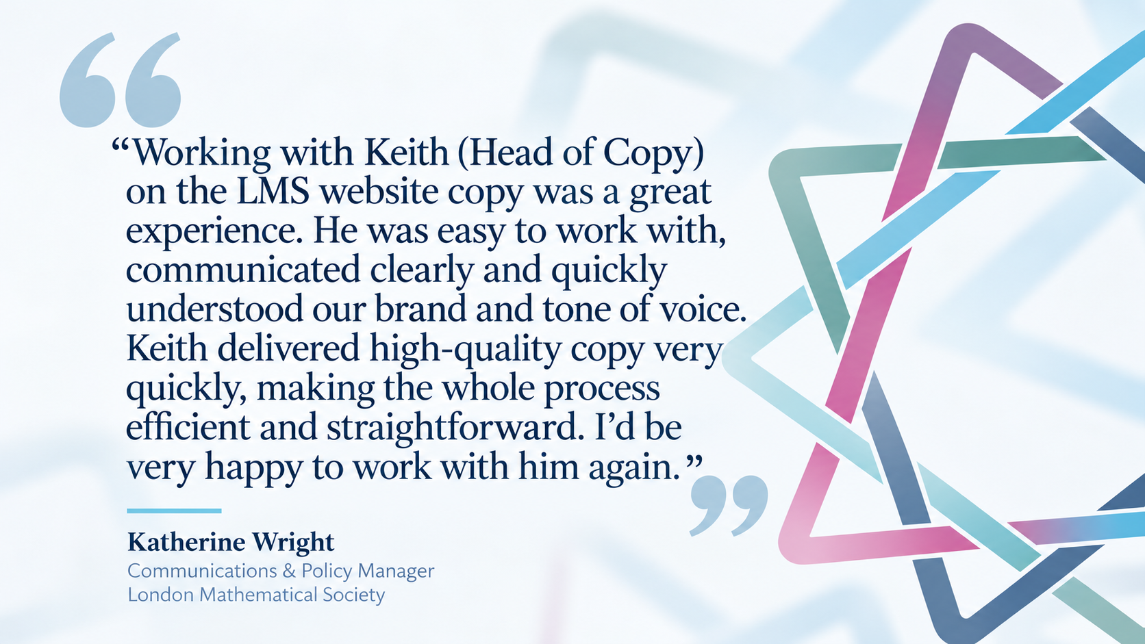
A testimonial quote graphic from Katherine Wright, Communications and Policy Manager at the London Mathematical Society, praising Keith (Head of Copy) for his clear communication, quick delivery, and understanding of brand tone while working on the LMS website copy.
Finding the right voice for an organisation with more than 160 years of history

Need help finding the right words?

A great website needs great content. At Fat Beehive, we don’t just design and build websites – we can help you work out what you need to say and how best to say it.

Whether you’re planning a new website, wrestling with existing content or simply don’t have the time or resources to write it yourself, we can take care of the words too.

Need some help with your website copy? Get in touch.

Get in touch

Speak to us about your project, get a quote