Delightful Ethical Digital

Sebastian's Action Trust

Supporting families better

Read the Sebastian's Action Trust case study

The challenge

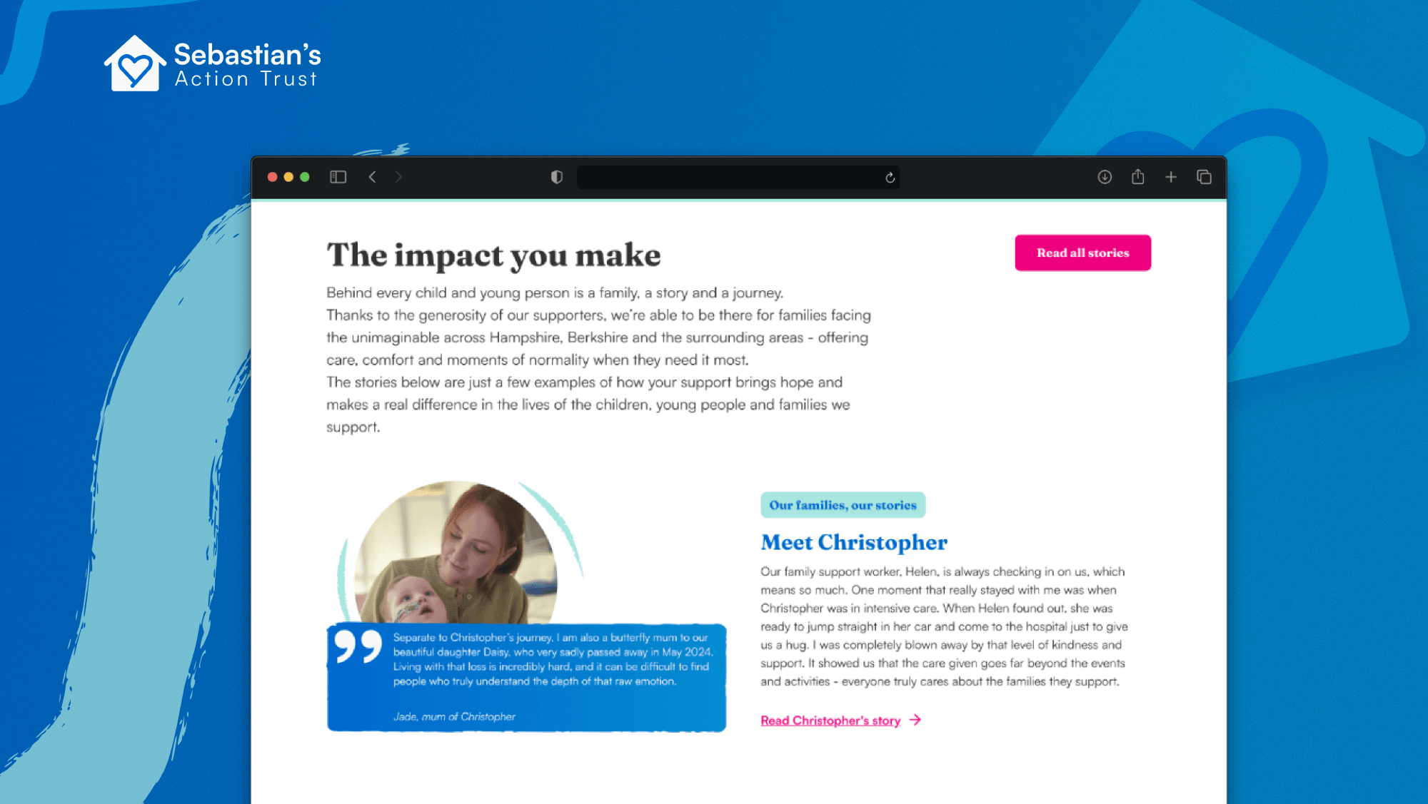
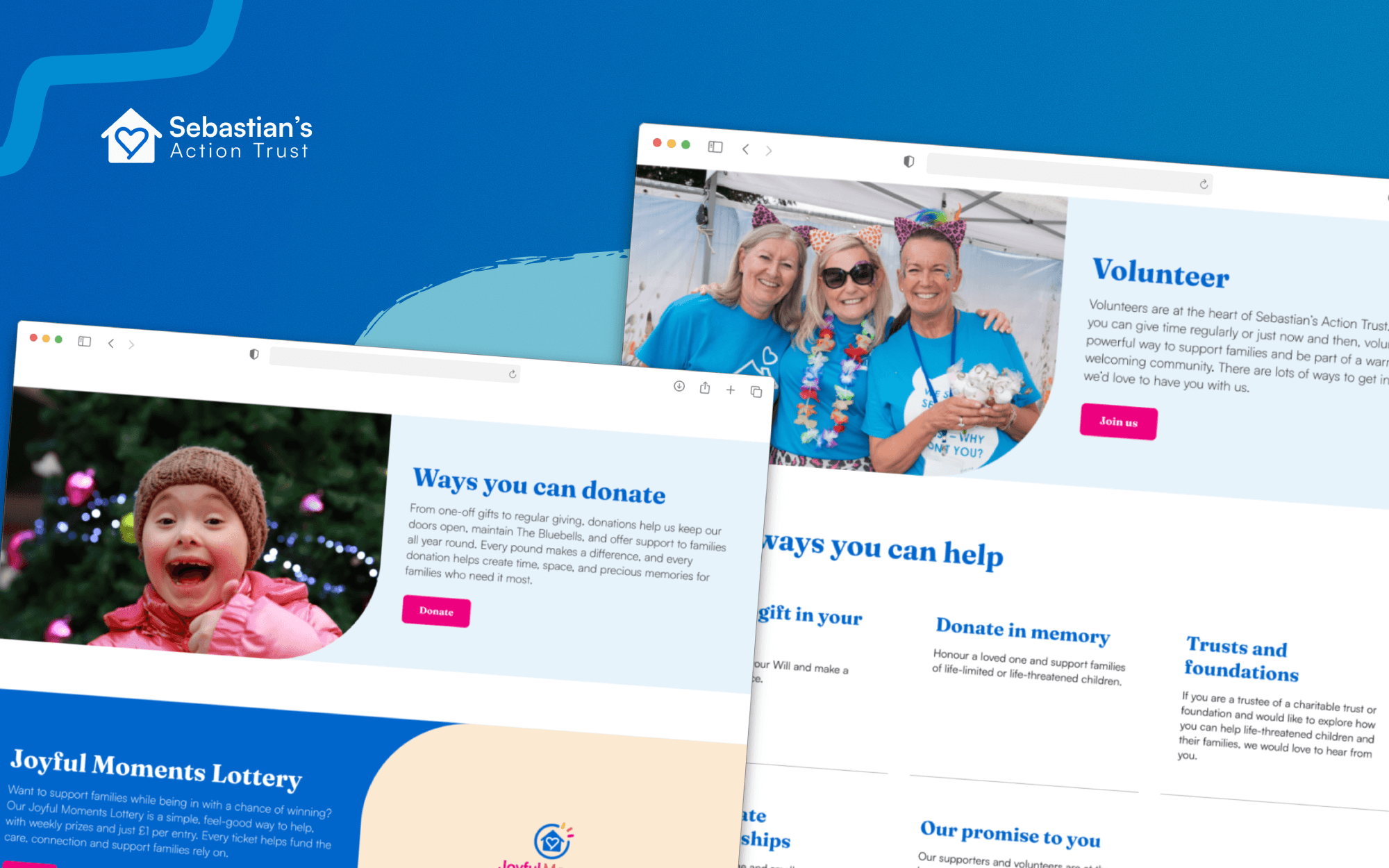
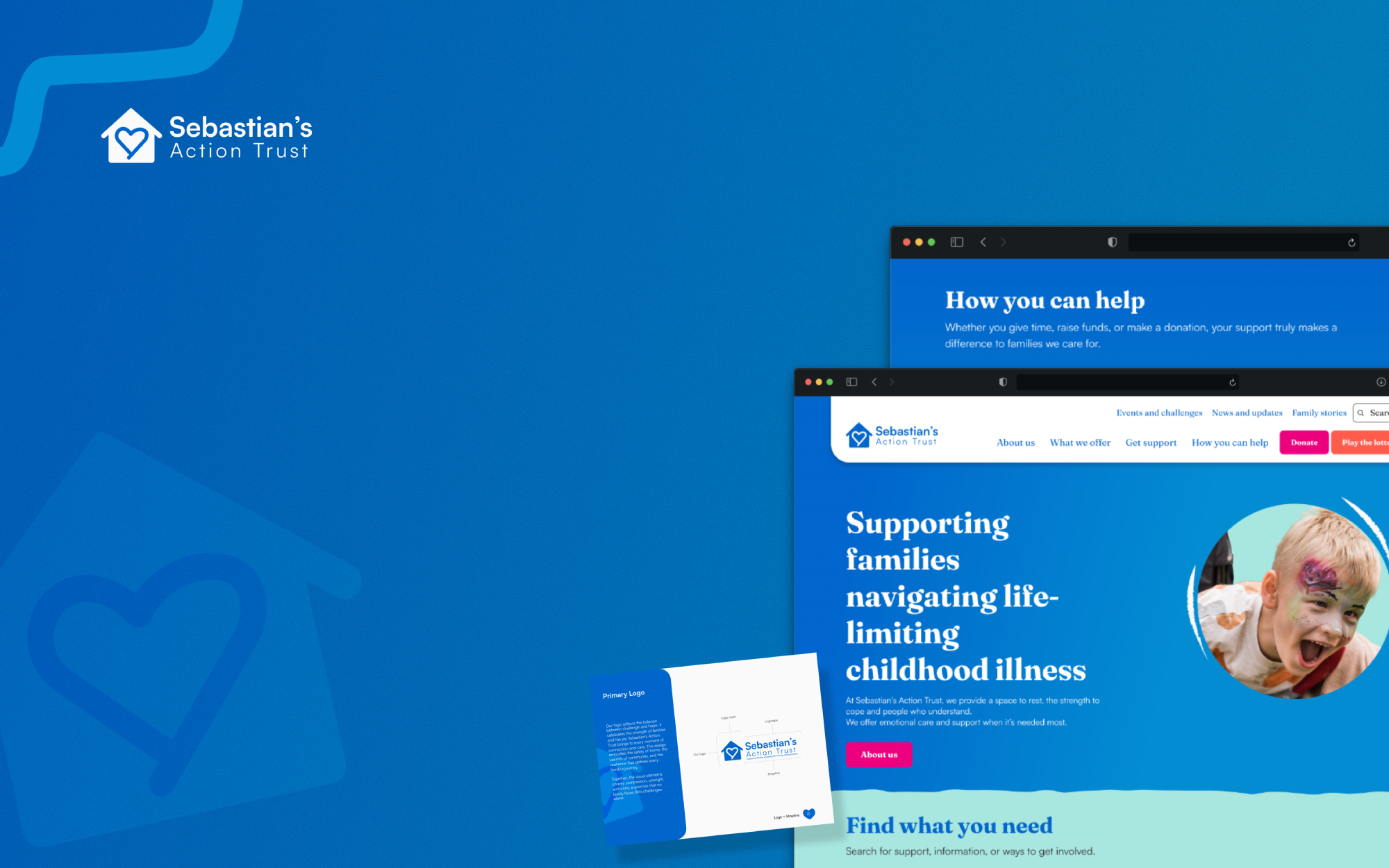
We worked with Sebastian’s Action Trust on a charity website design and brand refresh to allow them better help families and grow their fundraising. They support children with life-limiting conditions and their families, offering practical help, restorative breaks and a sense of community at some of the most challenging times in their lives.

But their brand and website weren’t keeping pace with the organisation they had become.

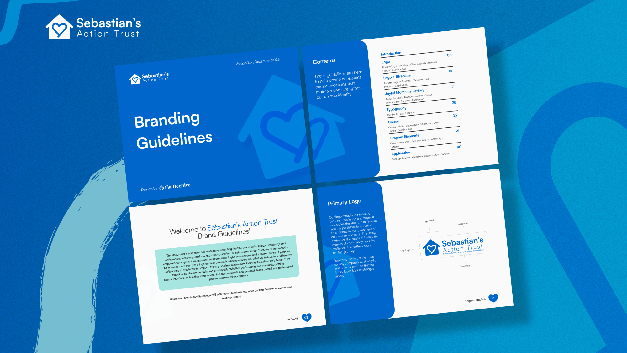
Their visual identity dated back to 2013, and their website — built in 2019 — had grown organically without a clear structure or consistent tone. It was difficult to navigate, visually inconsistent, and didn’t do enough to engage supporters or reflect the impact of the charity’s work.

At the same time, the charity had reached a point where things were shifting. They had a clearer sense of where they were heading, and a growing need to bring in more support from the public. The existing brand and website just weren’t doing enough to help with that.

So rather than treat brand and website as separate pieces of work, we tackled them together.


Bringing real family stories to the forefront, helps supporters connect with the impact of the charity’s work.

Our approach

We started by working through the basics with the Sebastian’s Action Trust team – what they wanted to say, who they needed to reach, and what the website actually needed to do. Supporters quickly came into focus as the priority audience, particularly as the charity looks to grow its fundraising. But just as importantly, the site still had to work for families coming to it for help – often at difficult moments, and often needing answers quickly.

On the brand side, the aim wasn’t to start from scratch, but to bring what was already there up to date.

We kept the core identity, but refreshed and modified the logo, while refining the colour palette and typography so things felt more consistent and considered. We also worked with the team to develop a new strapline – something that actually explains what the charity does, rather than relying on the name alone to carry that weight.

We also developed a dedicated identity for the Joyful Moments Lottery, supporting its role as a key driver of public fundraising while keeping it aligned with the wider brand.

Alongside that, we pulled everything together into a set of practical brand guidelines, plus templates the team can use day to day. The focus here was usability as much as appearance – making it easier for them to produce materials that feel consistent without needing design support every time.

Clear, practical brand guidelines and templates help the team create consistent materials day to day.

Diverse audiences

For the website, the challenge was making it work properly for two quite different audiences.

We reworked the structure to make those journeys clearer. Families looking for support can now find the right information without having to dig for it, while supporters are given clearer routes into donating, fundraising or getting involved.

Content played a big part in this. The old site was heavy and inconsistent, so we stripped things back and focused on what actually matters – clearer explanations, stronger stories, and a better balance between text and visual content. The page layouts are more flexible now too, so the team can shape content depending on what they’re trying to say.

We also tightened up the calls to action across the site. Nothing over-engineered – just making the next step obvious.

Clearer pathways into donating, volunteering and getting involved make it easier for supporters to take action.

There were also some practical fixes to deal with behind the scenes.

Forms, in particular, were clunky and time-consuming to manage. We redesigned these so they’re easier to use and don’t create extra admin for the team. In some cases, that meant removing manual steps that were slowing things down unnecessarily.

More broadly, the site is now quicker, works properly across devices, and is much easier for the team to update themselves – which was a big part of the brief.

As Jo Sumnall, Head of Fundraising and Marketing put it:

“We’re over the moon with both the brand identity and the website and were so pleased to go live last week. It’s been great working with you on it – it feels as if we achieved a lot in a relatively short space of time and in particular, we were really impressed by how Prosper (design lead) just ‘got us’ from the start and rendered our essence so beautifully in the creative.”

The result is a brand and website that feel much closer to the organisation as it is today.

It’s clearer, more consistent, and easier to use. Families can find the support they need without friction, and supporters have a much clearer sense of how to get involved and make a difference.

Just as importantly, the team now has a platform they can build on – something that supports their ambitions to grow awareness, increase income, and reach more families who need them.

If you’re looking to elevate your digital presence we’d love to hear from you.

www.sebastiansactiontrust.org

Get in touch

Speak to us about your project, get a quote