The challenge
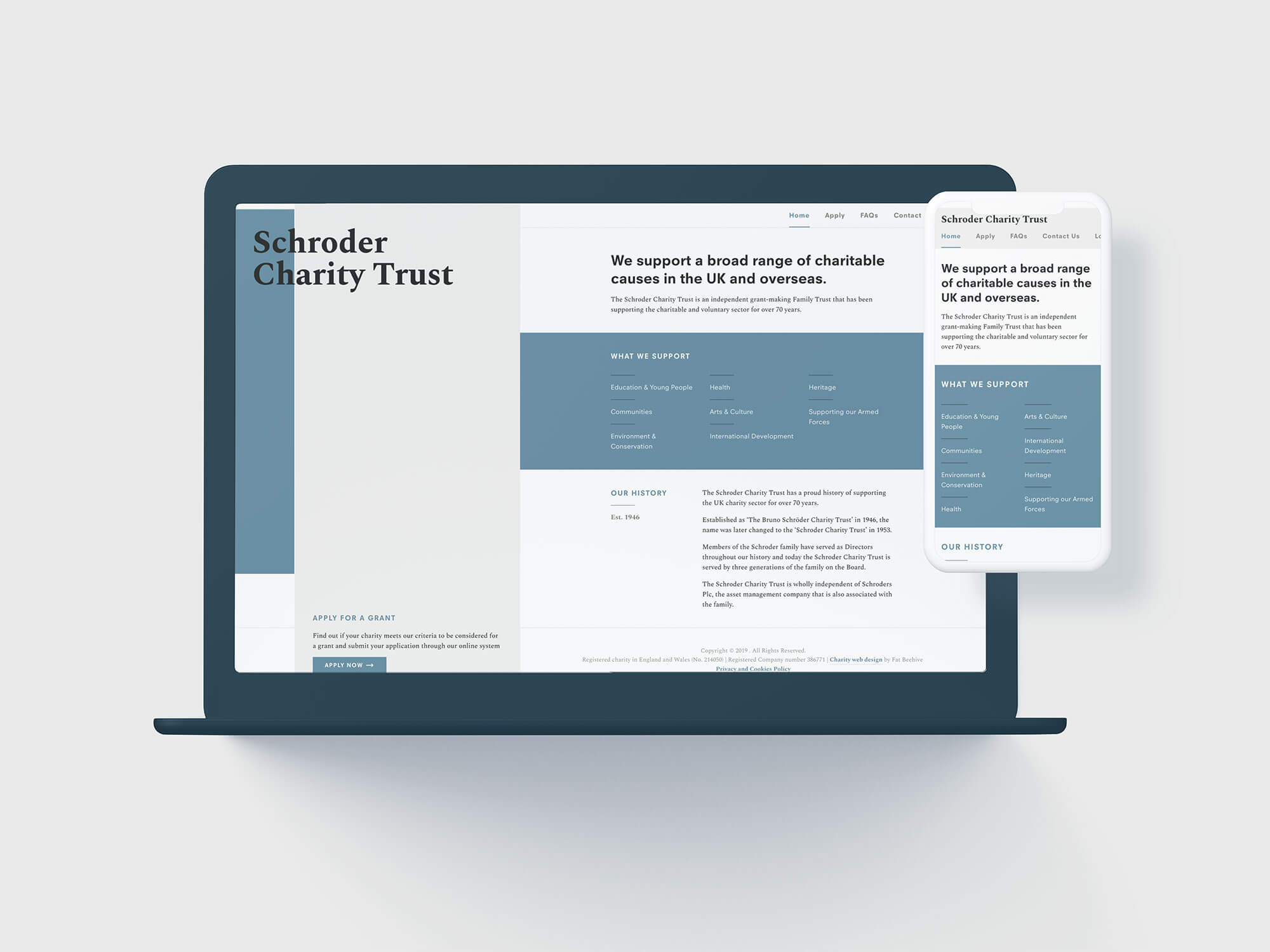
Previously, The Schroder Charity Trust managed the hundreds of applications that they receive on paper, and had no online presence at all. The move online also raised the need for a basic brand style including a logo; something they’d never had before.
Our approach
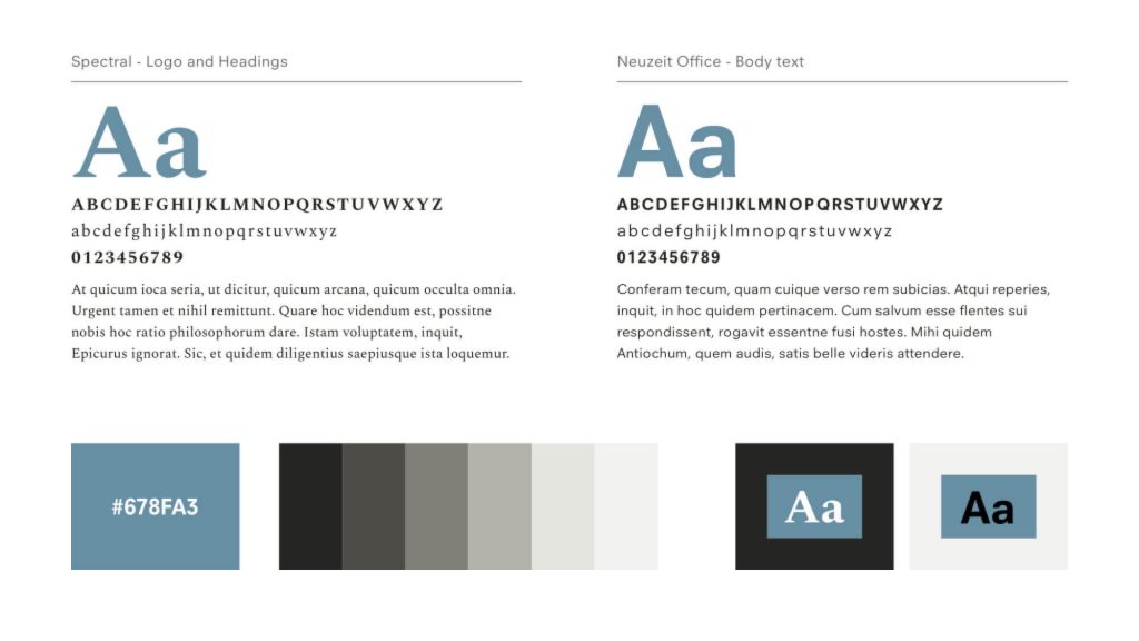
For the brand, we kept things classic and stripped-back. With no available image library, the strength of our design rested squarely on typographic principles. Our bold design keeps potentially dull pages such as forms visually interesting.